Krebsberatungs-App
A Shared Space for Counsellors and Patients
At-A-Glance:
A human-centred platform uniting cancer patients, their families, and psycho-oncology centres across Germany. Mobile supports patients and relatives; desktop supports counsellors, so access is clear, paperwork is lighter, and human care stays primary.
THE PROBLEM
Help for cancer exists, but patients can’t get to it.
Patients seeking psycho-oncological support often do not know where to start, get lost in paperwork and only find help by accident, while counsellors juggle emails, documents and video tools with no single flow to book, share or start sessions. Fraunhofer ISI, Hochschule Heilbronn and the Freiburg Cancer Counselling Centre teamed up to create one ecosystem, a mobile app for patients and a web app for counsellors, and I was brought in to design both.
Now let me show you the highlights of the mobile app for patients:
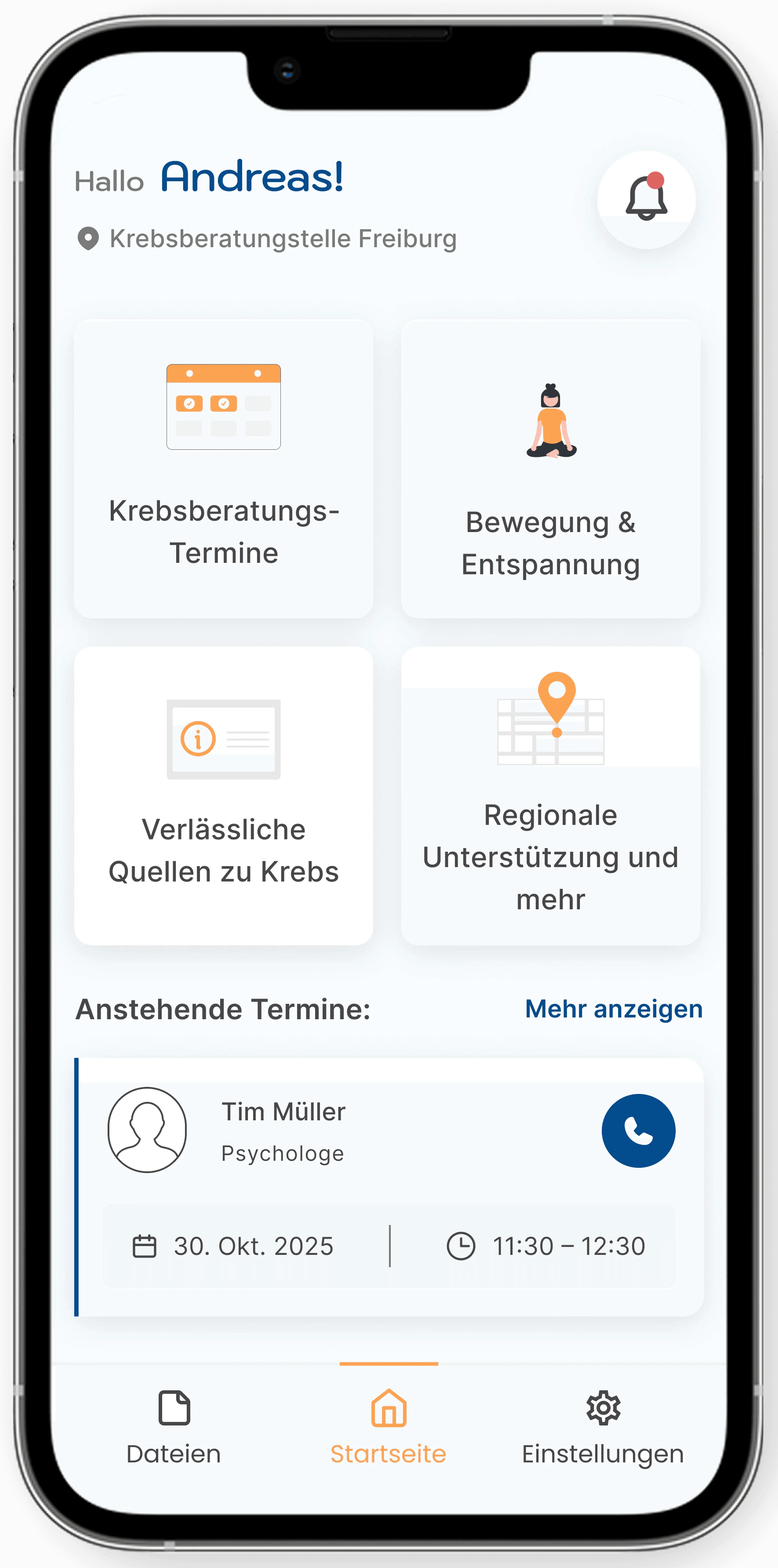
Homepage
Interviews showed patients mainly want to:
- Book sessions.
- Access reliable info related to cancer.
- Find out local and regional support services.
- Access quick guided exercises and meditation.
So the homepage is built exactly around those four tiles, plus a clear next-appointment card.
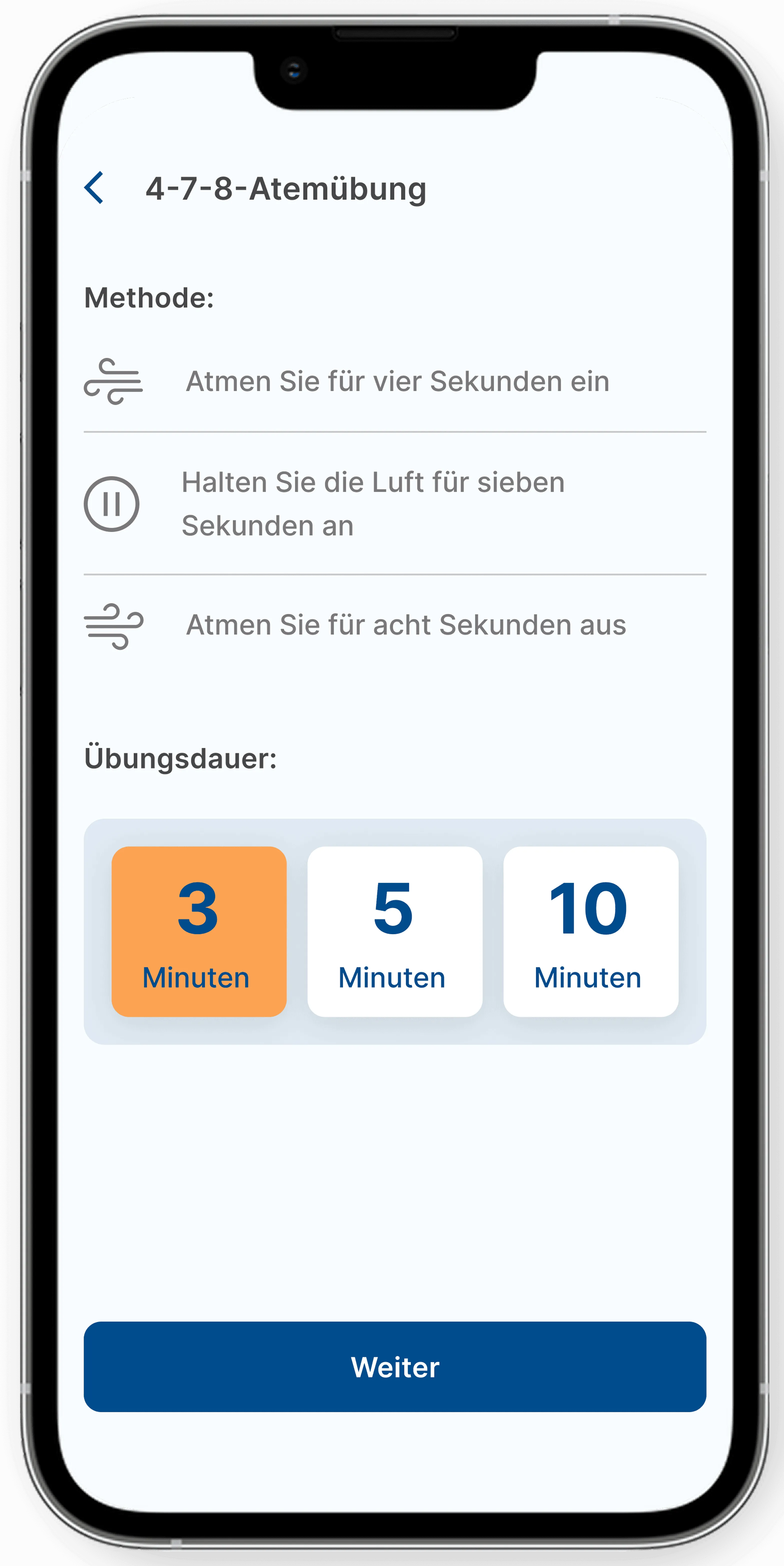
Meditation Coach
Patients asked for fast, calming exercises, especially during stress spikes. So this screen uses minimal text, clear rhythm cues, and a single action button to avoid cognitive load.
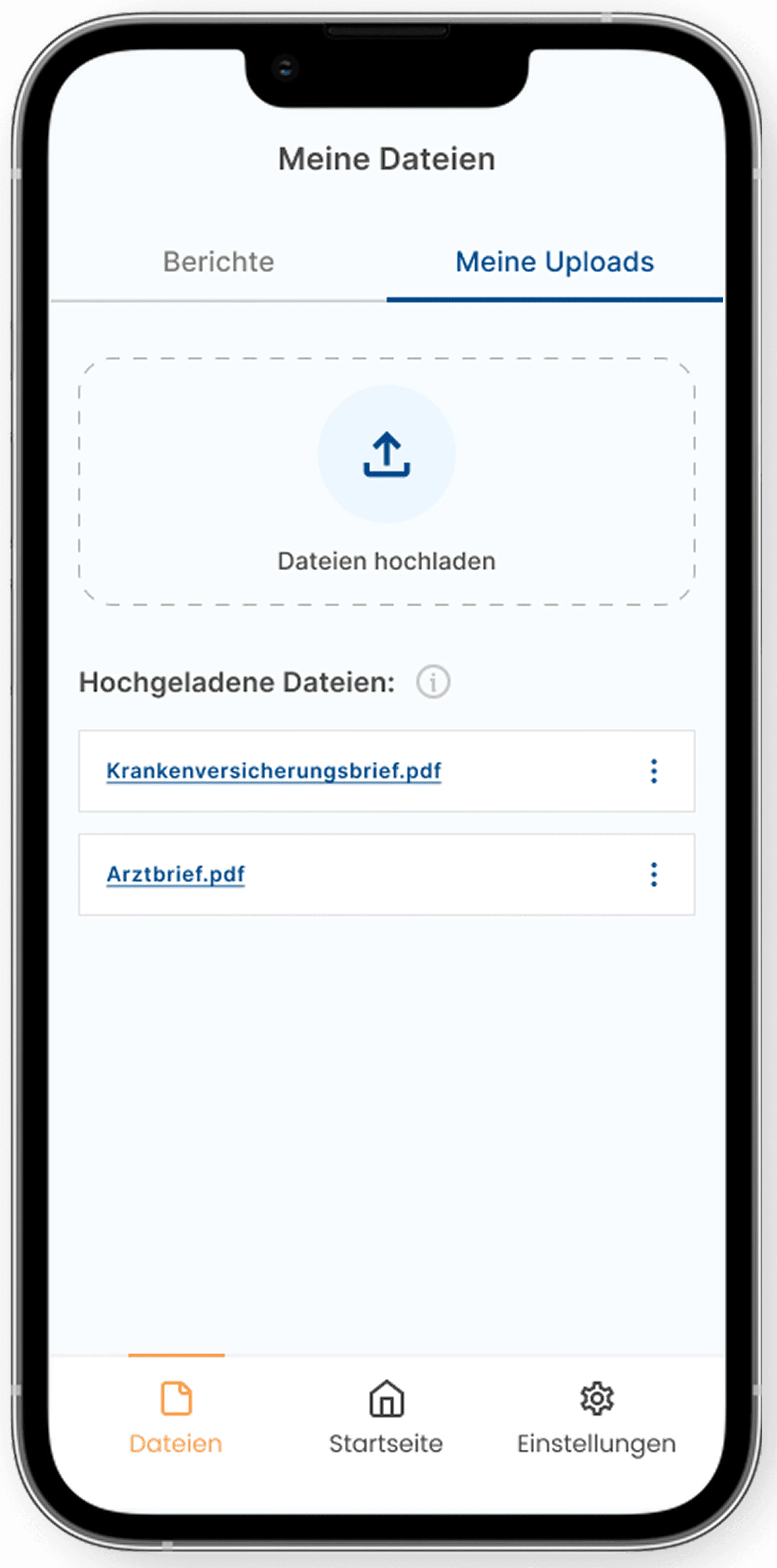
Tidy Documents Drawer
Patients told us they lose documents across emails and folders, so this screen gives them one clear place to upload, store, and share files with counsellors.
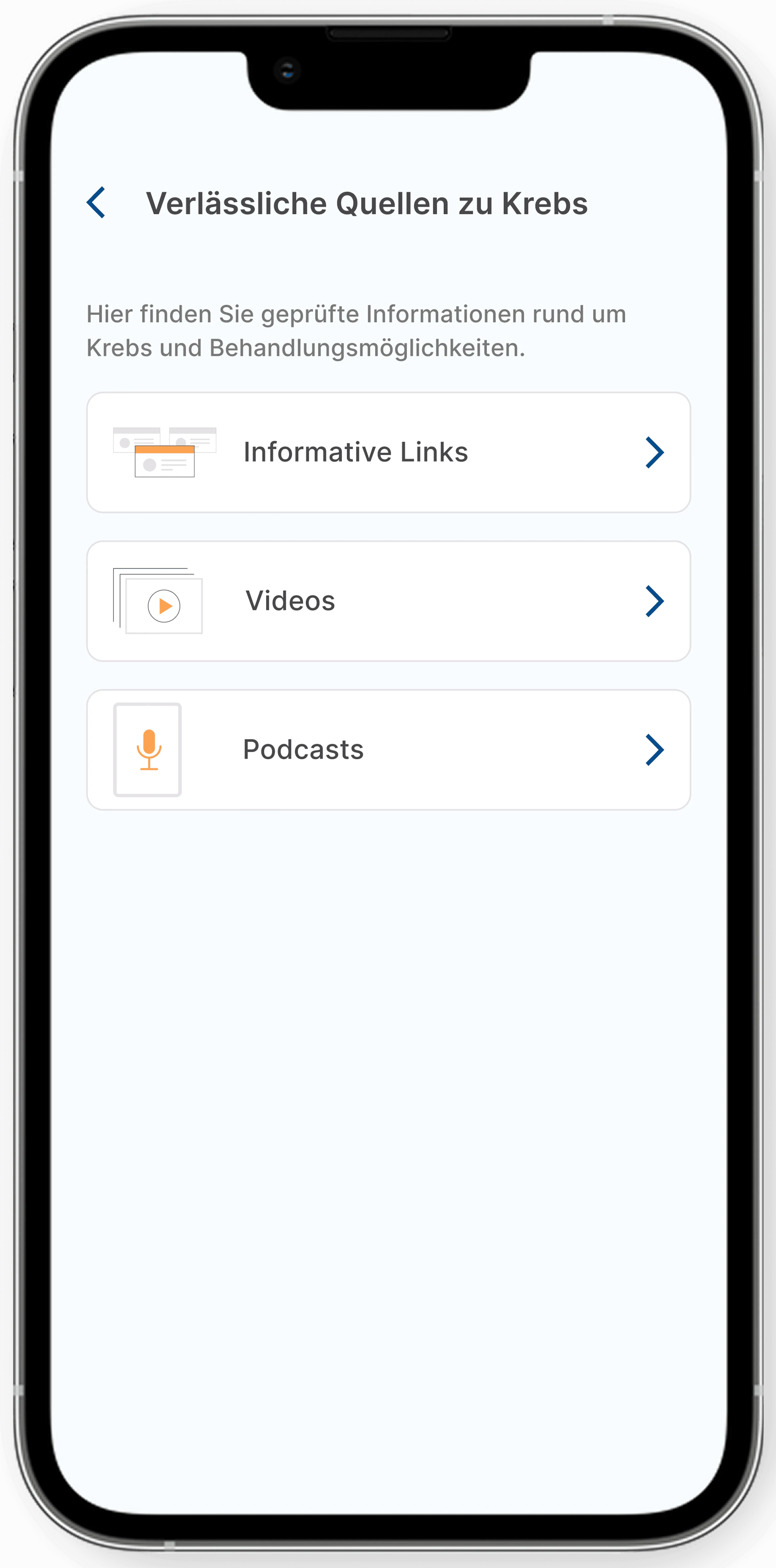
Reliable Cancer Sources
Because patients were exhausted by unreliable cancer information, we added a vetted resource hub; trusted links, videos, and podcasts reviewed by real counselling centres.
01.EMPATHISE
"Second-hand research gives you data, but first-hand research gives you empathy"

Therefore, even with prior research available, I did my own.
Even with Fraunhofer research available, I wanted first-hand insight to avoid blind spots and hear needs in users’ own words. I started with secondary research, reviewing guidelines, health reports and existing cancer apps, and found that:
#1 The Need is Real
About one in three people with cancer has a diagnosable mental disorder, such as anxiety or depression, a strong sign of the need for psycho-oncological support. (Source: Mehnert et al., Journal of Clinical Oncology, 2014)
#2 Family Members Struggle Just as Much as Patients
Research highlights that family members of cancer patients often experience serious psychological strain, sometimes equal to or greater than the patients themselves.
#3 Limited Reach: Too Few Psycho-Oncology Centres for the Country’s Needs
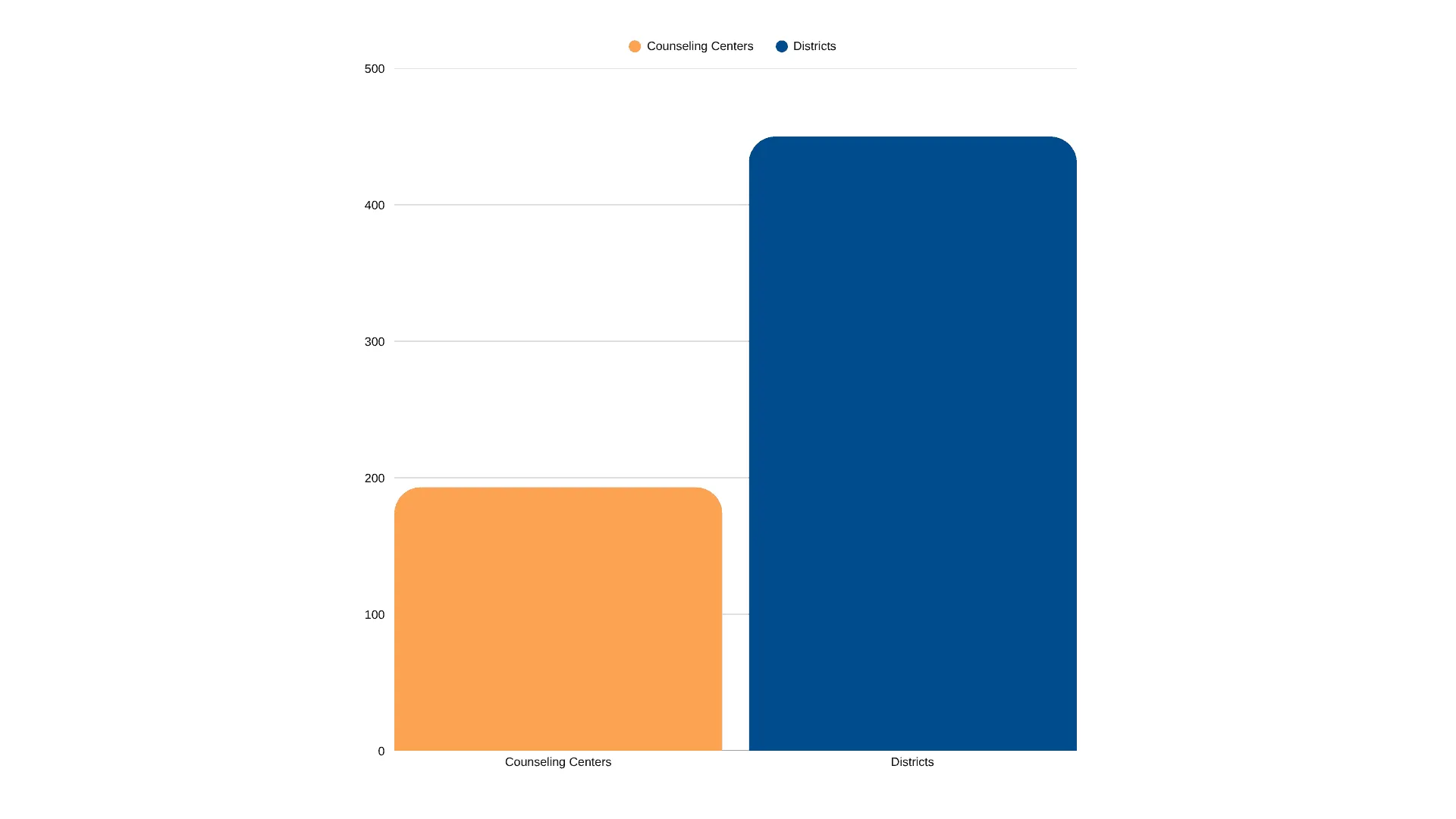
Despite national guidelines promising equal access to psychosocial care, the country still struggles with limited reach: according to the project’s earlier research, there were only about 193 psychosocial counselling centres across Germany’s ~400 districts.
#4 Current Apps Educate Patients, But Don’t Connect Them to Real Counsellors
Strong symptom/education apps existed (e.g., MIKA; PINK! Coach as a DiGA), but none linked people to real counselling centres with scheduling, documents, or follow-ups.
#5 The Solution Fits the Moment
With most people already using smartphones, bringing support into one simple digital place became the easiest way to help patients find, book, and manage care.
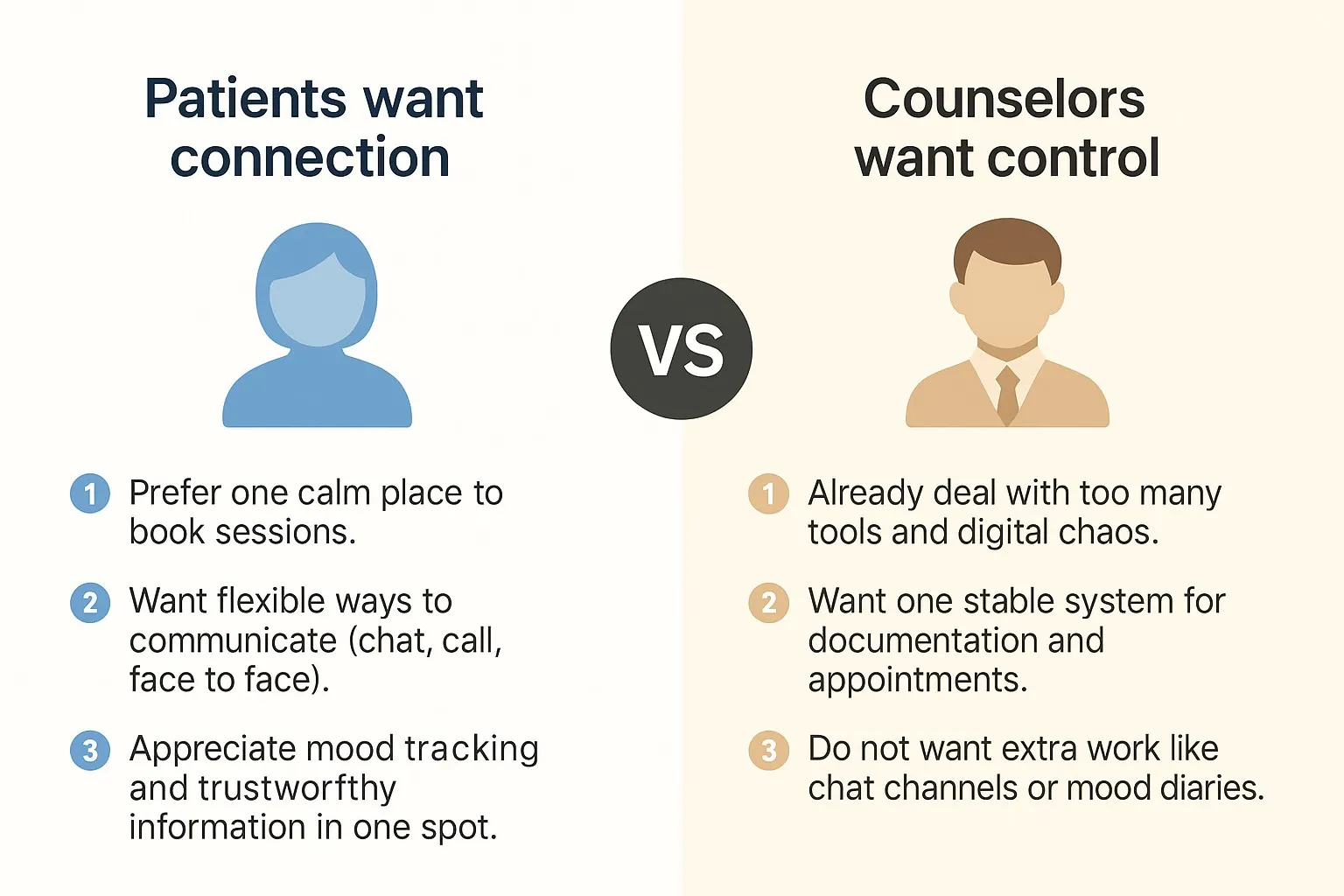
Interviews revealed a clear mismatch between patient and counsellor priorities.
I spent weeks on the floor (virtually), running remote interviews and conversations with patients (n=6) and counsellors (n=5) to understand their day-to-day reality. As a result, a clear split in expectations surfaced:
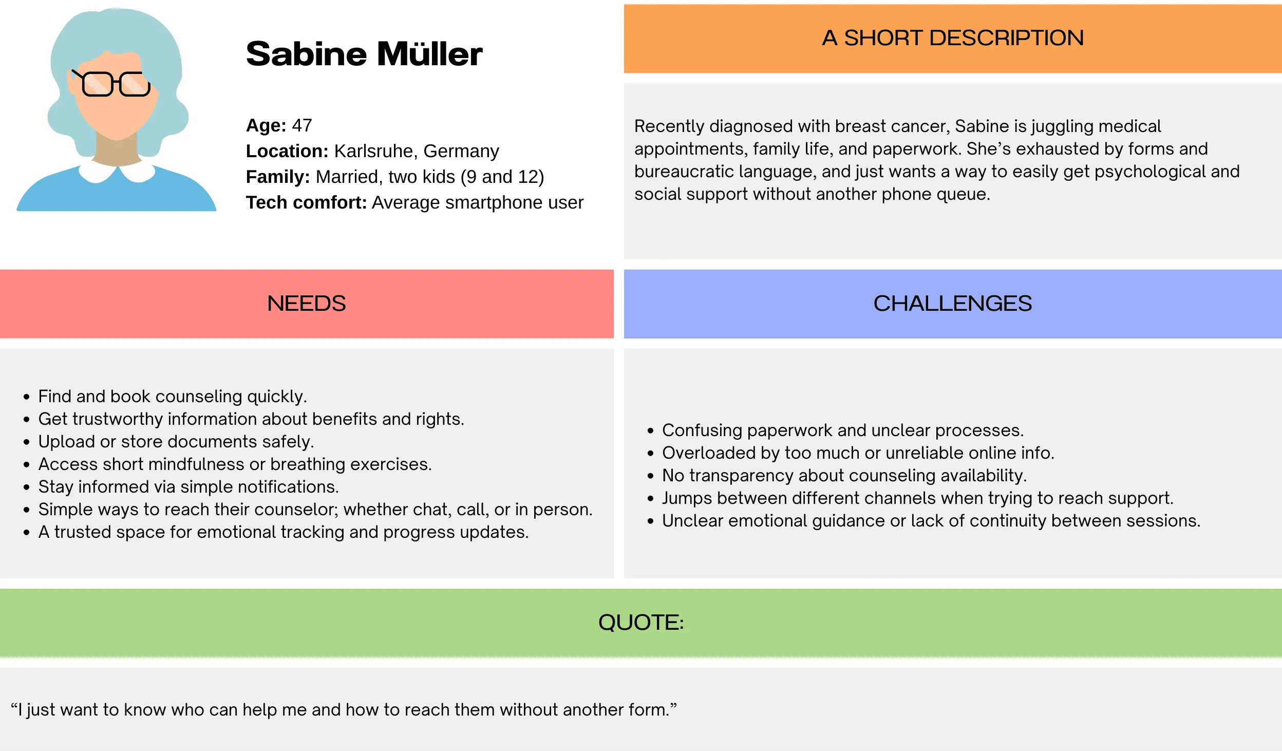
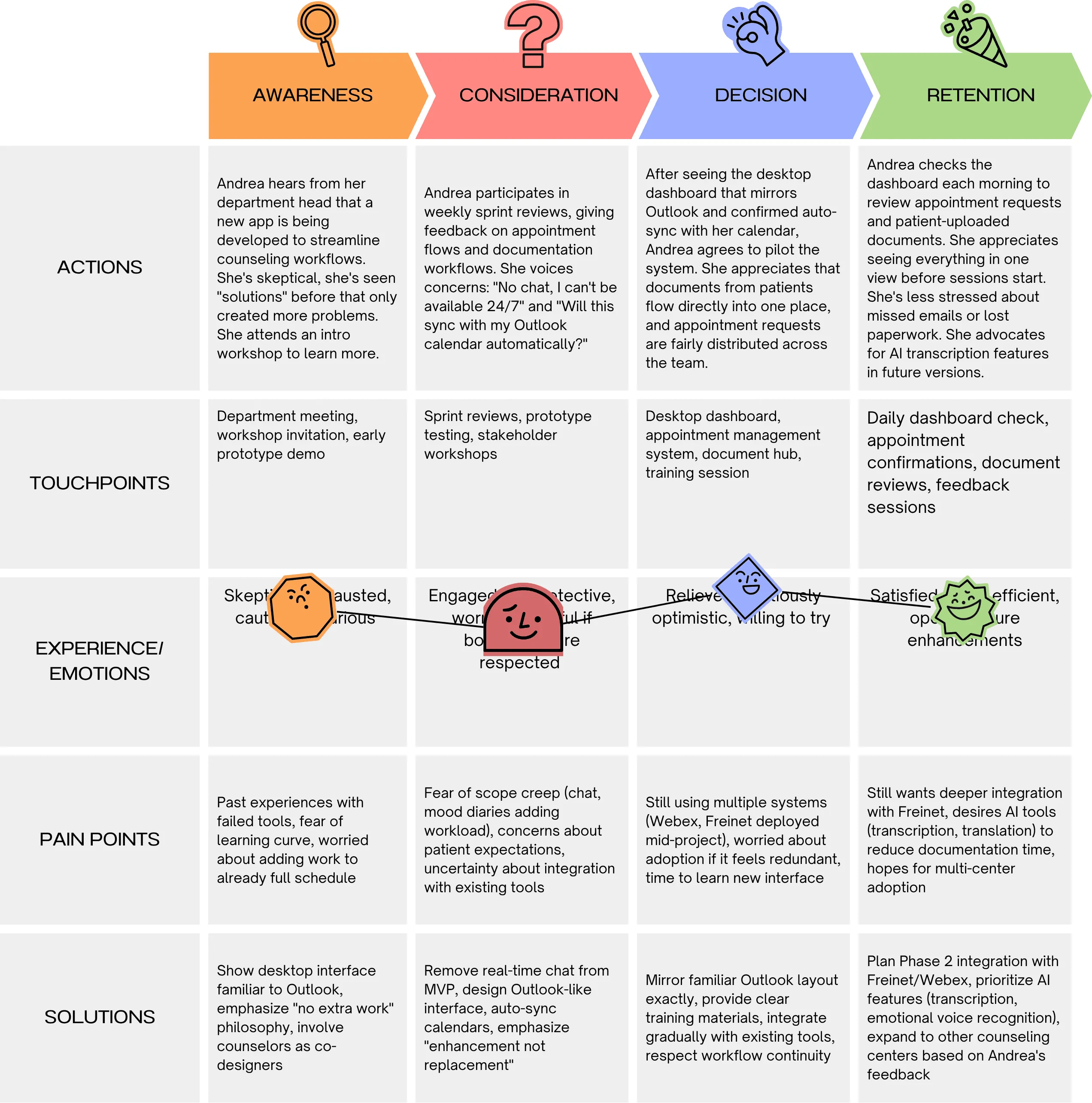
Using interview insights, I built personas and journeys that kept the team close to patients and counsellors.
Patient Persona:
Counsellor Persona:
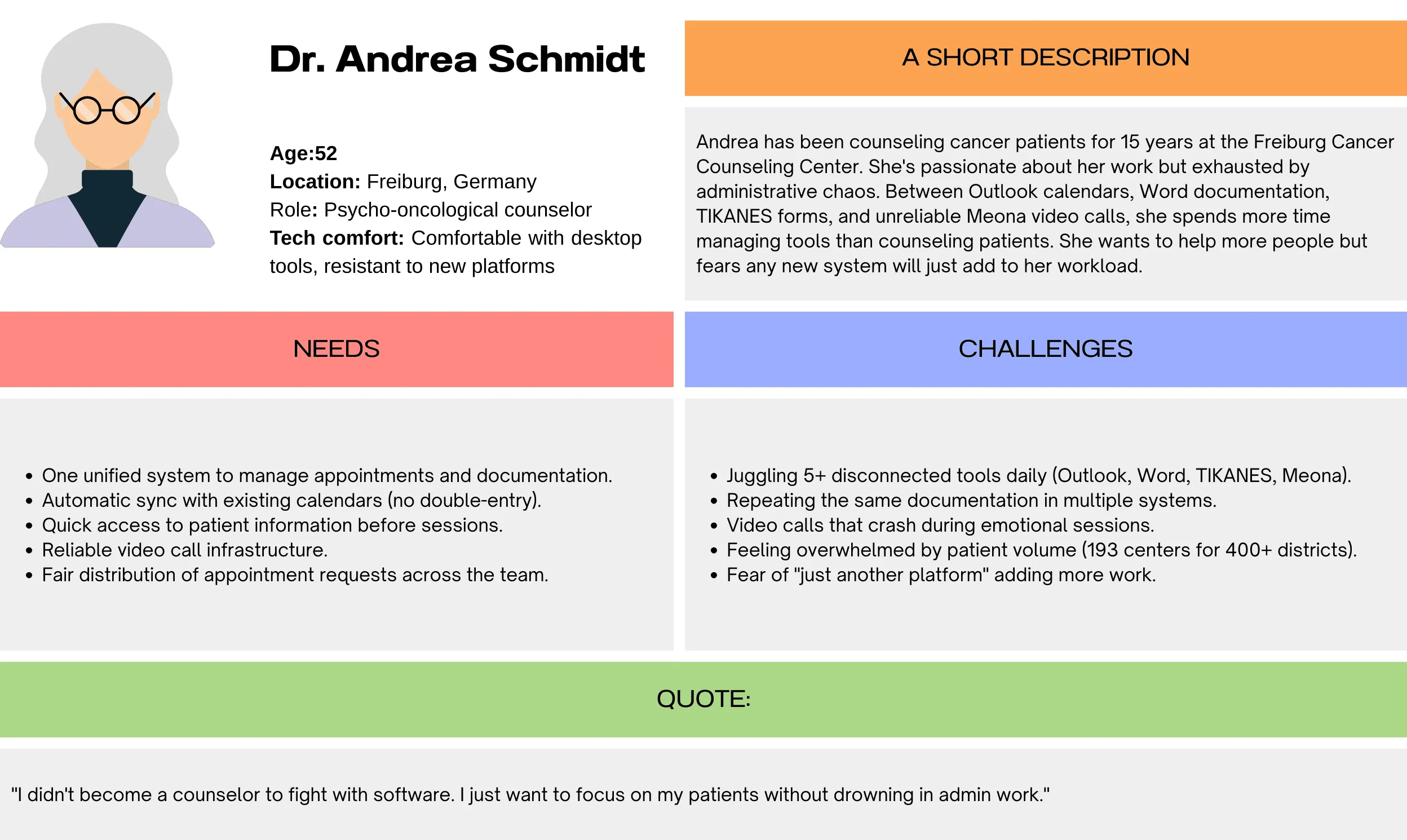
Patient Journey Map:
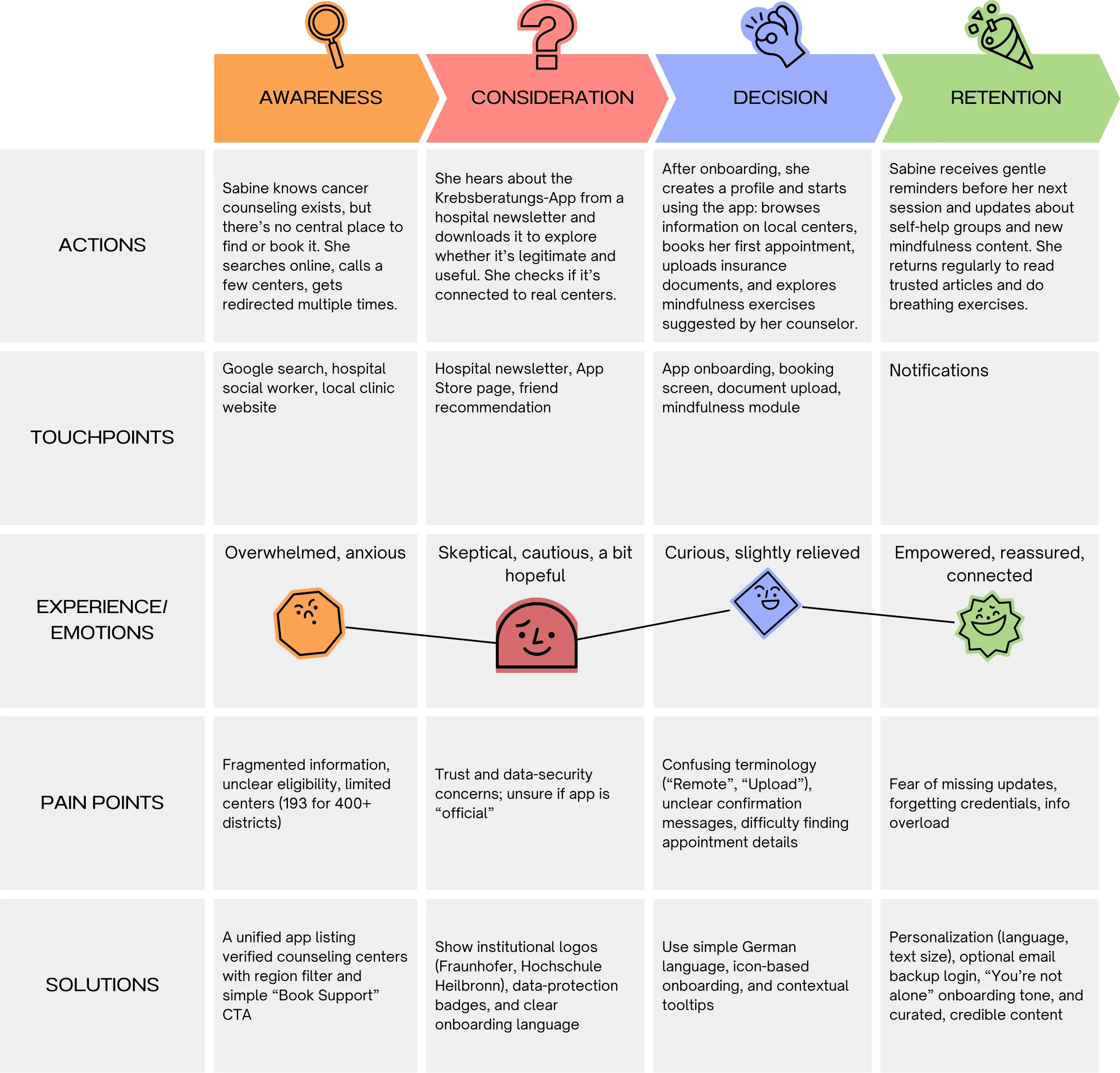
Counsellor Journey Map
02.IDEATE
We used co-design sprints to unpack and address each patient–counsellor conflict.
In these co-design sprints within the team, we turned a messy wish list into concrete requirements, working through each patient–counsellor conflict and either finding a middle ground or clearly prioritising one side.
| Patients Said: | Counsellors Said: | What We Decided (MVP): | |
|---|---|---|---|
| 1. | “I just want to book a session without waiting on the phone.” | “We already manage Outlook, Meona, and other calendars; please don’t give us another tool to update.” | Built self-service appointment booking synced automatically with counsellor schedules; no double work. |
| 2. | “I live too far away; I need a simple, secure way to talk to my counsellor online.” | “Our current video tool (Meona) is unstable. We need a reliable, GDPR-compliant solution.” | Added a secure, GDPR-compliant video calling system that works reliably. |
| 3. | “I want to message my counsellor whenever I’m anxious or need help.” | “No chat, please. I don’t have time to answer messages.” | Removed chat, as counsellors had no capacity to take on this feature. |
| 4. | “I don’t trust random websites. I want reliable information I can actually use.” | “Patients often bring printouts from Google; it’s exhausting to fact-check.” | Added a verified information hub, curated with Freiburg Cancer Counselling Centre experts: reliable and readable. |
| 5. | “It’s so much paperwork; I never know which form goes where.” | “We lose time emailing PDFs back and forth.” | Added a secure document exchange, centralised for both sides. |
| 6. | “Tracking my emotional state via a mood diary would help me discuss patterns with my counsellor.” | “No, please. If patients share their mood diary with me, I’d be obliged to read it, and that would be a lot to read for every patient.” | Removed the mood diary. Kept emotional support via guided breathing exercises, vetted wellness articles and appointment booking instead. |
| 7. | “It’s hard to read small text or find things when I’m tired.” | “Older patients struggle with tech; we need to make this foolproof.” | Added accessibility settings, text resizing, night mode, and simplified labels in plain German. Designed for clarity, not clutter. |
- 1.
Patients Said:
“I just want to book a session without waiting on the phone.”
Counsellors Said:
“We already manage Outlook, Meona, and other calendars; please don’t give us another tool to update.”
What We Decided (MVP):
Built self-service appointment booking synced automatically with counsellor schedules; no double work.
- 2.
Patients Said:
“I live too far away; I need a simple, secure way to talk to my counsellor online.”
Counsellors Said:
“Our current video tool (Meona) is unstable. We need a reliable, GDPR-compliant solution.”
What We Decided (MVP):
Added a secure, GDPR-compliant video calling system that works reliably.
- 3.
Patients Said:
“I want to message my counsellor whenever I’m anxious or need help.”
Counsellors Said:
“No chat, please. I don’t have time to answer messages.”
What We Decided (MVP):
Removed chat, as counsellors had no capacity to take on this feature.
- 4.
Patients Said:
“I don’t trust random websites. I want reliable information I can actually use.”
Counsellors Said:
“Patients often bring printouts from Google; it’s exhausting to fact-check.”
What We Decided (MVP):
Added a verified information hub, curated with Freiburg Cancer Counselling Centre experts: reliable and readable.
- 5.
Patients Said:
“It’s so much paperwork; I never know which form goes where.”
Counsellors Said:
“We lose time emailing PDFs back and forth.”
What We Decided (MVP):
Added a secure document exchange, centralised for both sides.
- 6.
Patients Said:
“Tracking my emotional state via a mood diary would help me discuss patterns with my counsellor.”
Counsellors Said:
“No, please. If patients share their mood diary with me, I’d be obliged to read it, and that would be a lot to read for every patient.”
What We Decided (MVP):
Removed the mood diary. Kept emotional support via guided breathing exercises, vetted wellness articles and appointment booking instead.
- 7.
Patients Said:
“It’s hard to read small text or find things when I’m tired.”
Counsellors Said:
“Older patients struggle with tech; we need to make this foolproof.”
What We Decided (MVP):
Added accessibility settings, text resizing, night mode, and simplified labels in plain German. Designed for clarity, not clutter.
Afterwards, I mapped the entire product to bring clarity to the scope.
03.PROTOTYPE
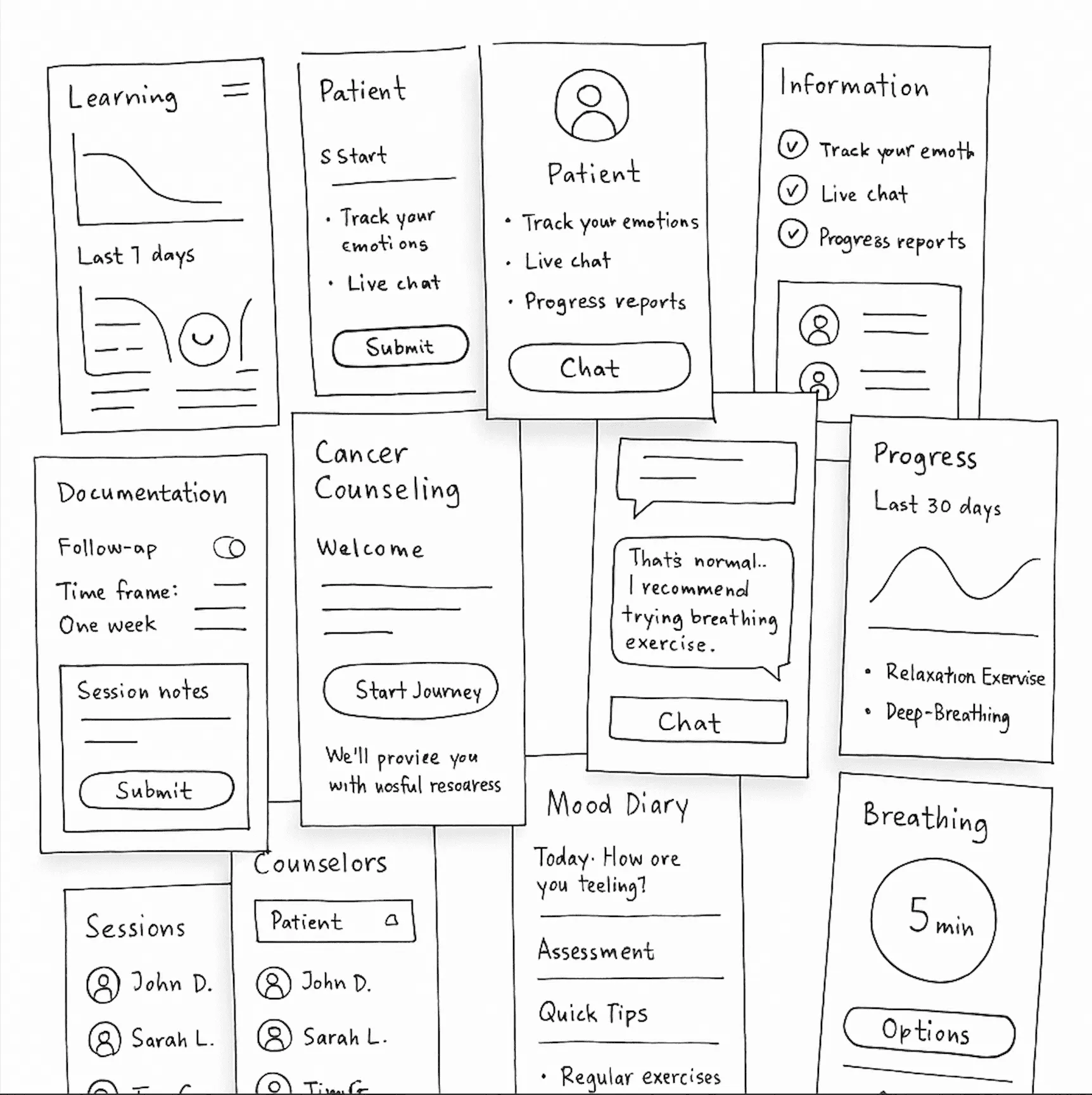
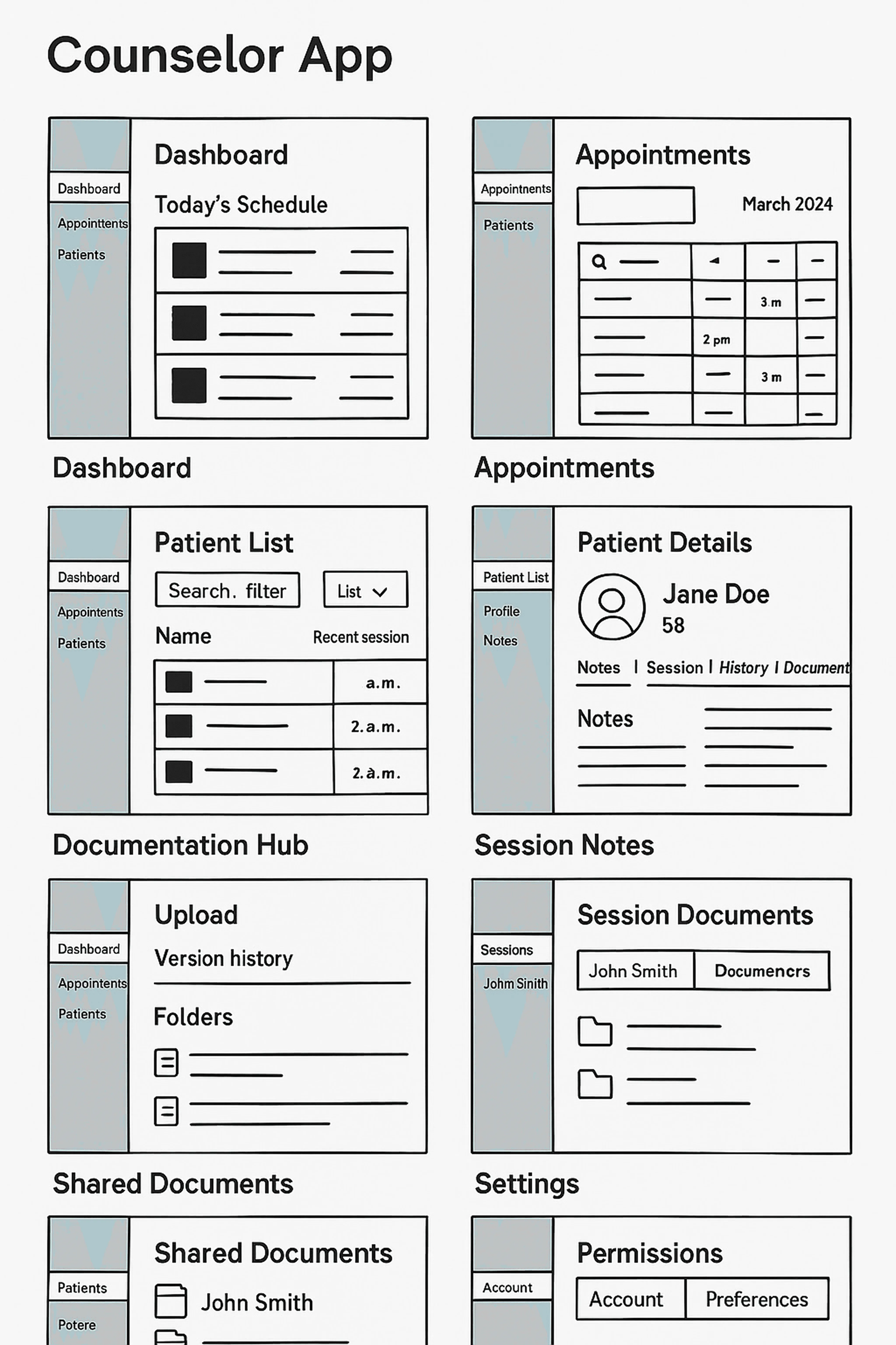
I started with lo-fi wireframes for desktop and mobile, then tested and refined them over several rounds.
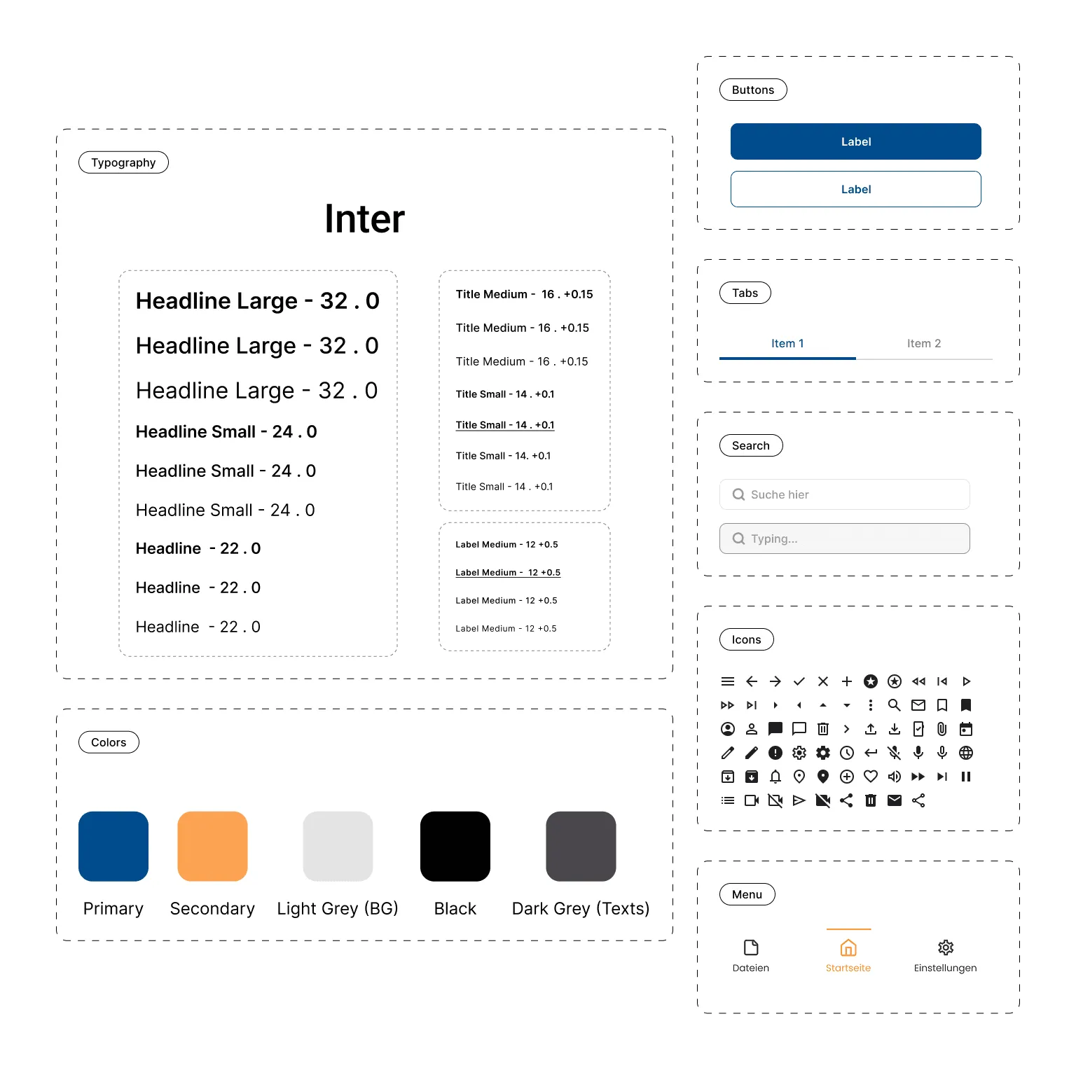
I then adapted Material 3 into a cohesive, accessible design system.
And below are the highlights of the desktop app for counsellors:
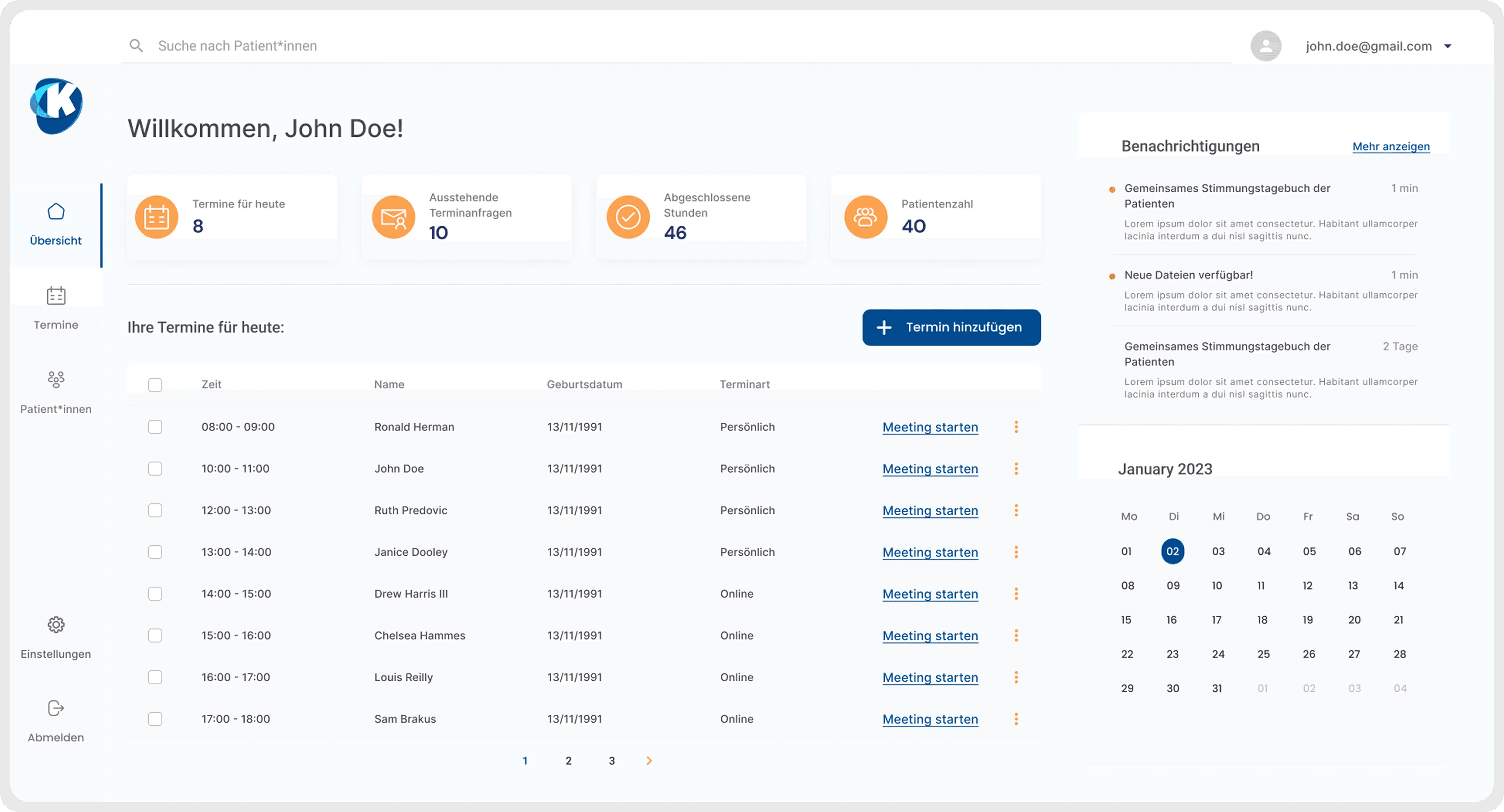
Homepage
Counsellors asked for “one place to see everything.” The homepage delivers that: live schedule, incoming requests, updates and documents in one view, so counsellors don’t have to switch between tools.
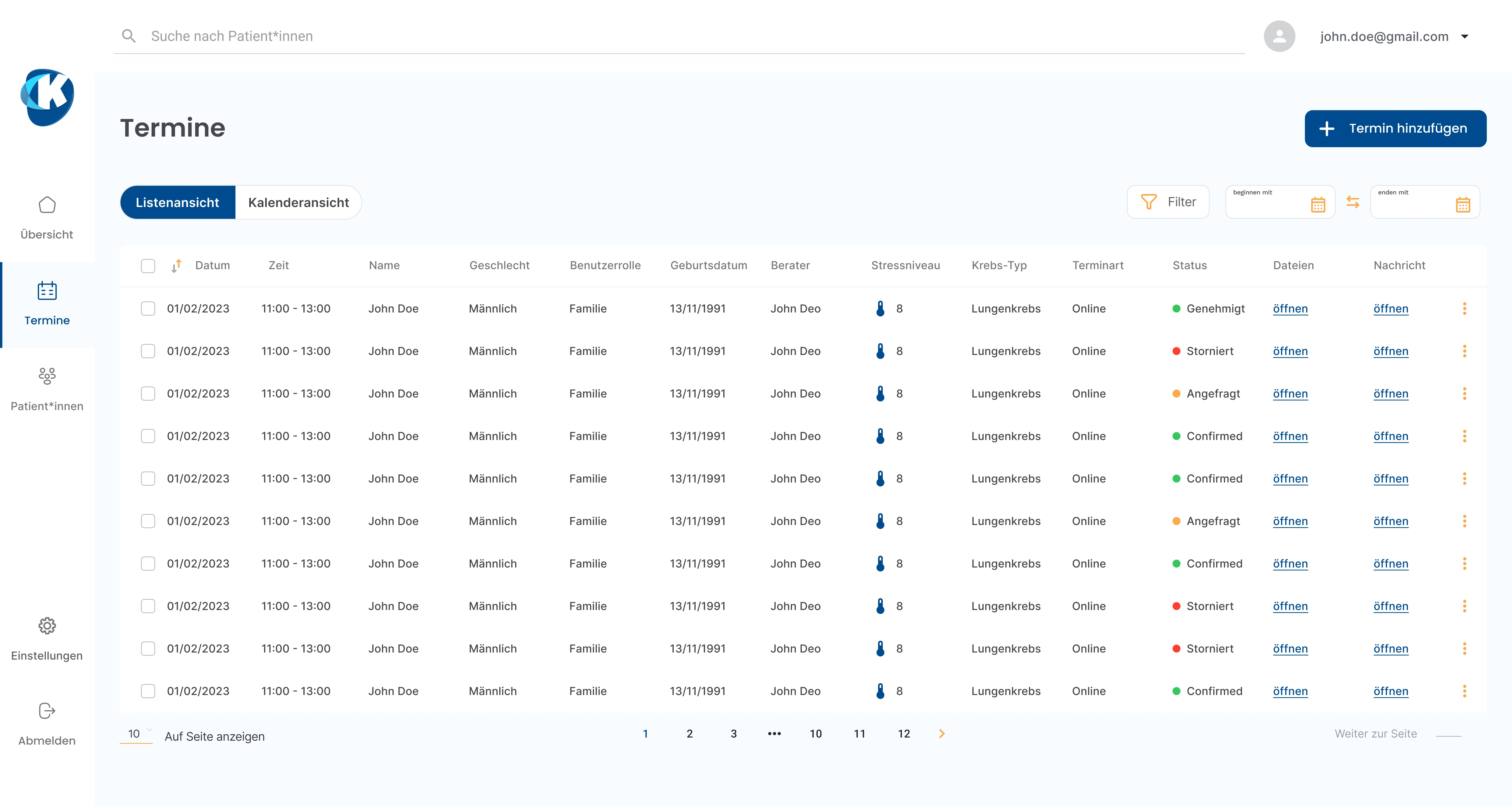
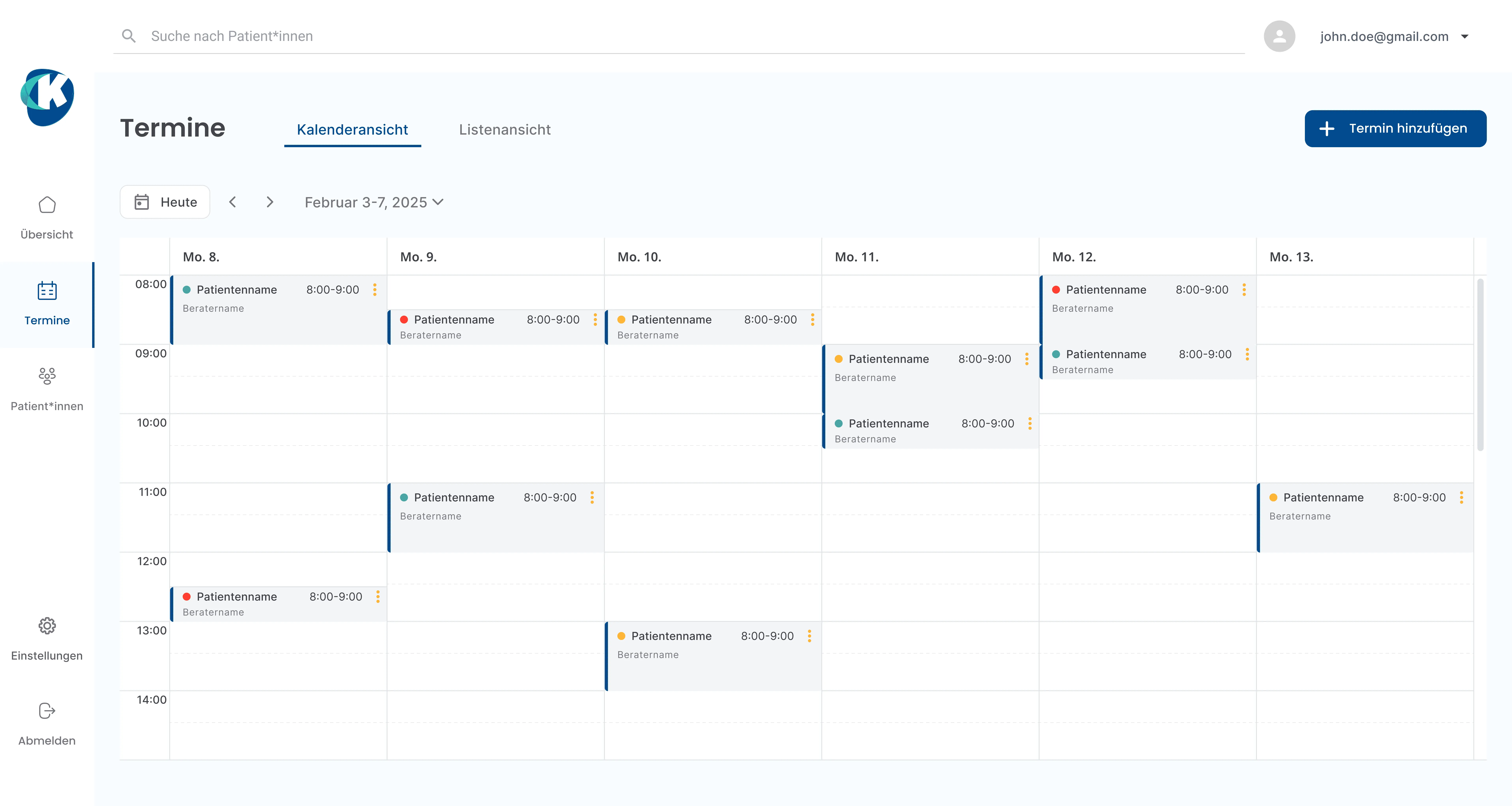
Appointment Management
User research revealed counsellors needed one trustworthy system for sessions; something their current mix of Outlook and Meona couldn’t provide. This unified calendar gives them one place to view, start, reschedule, or organise appointments without jumping between tools.
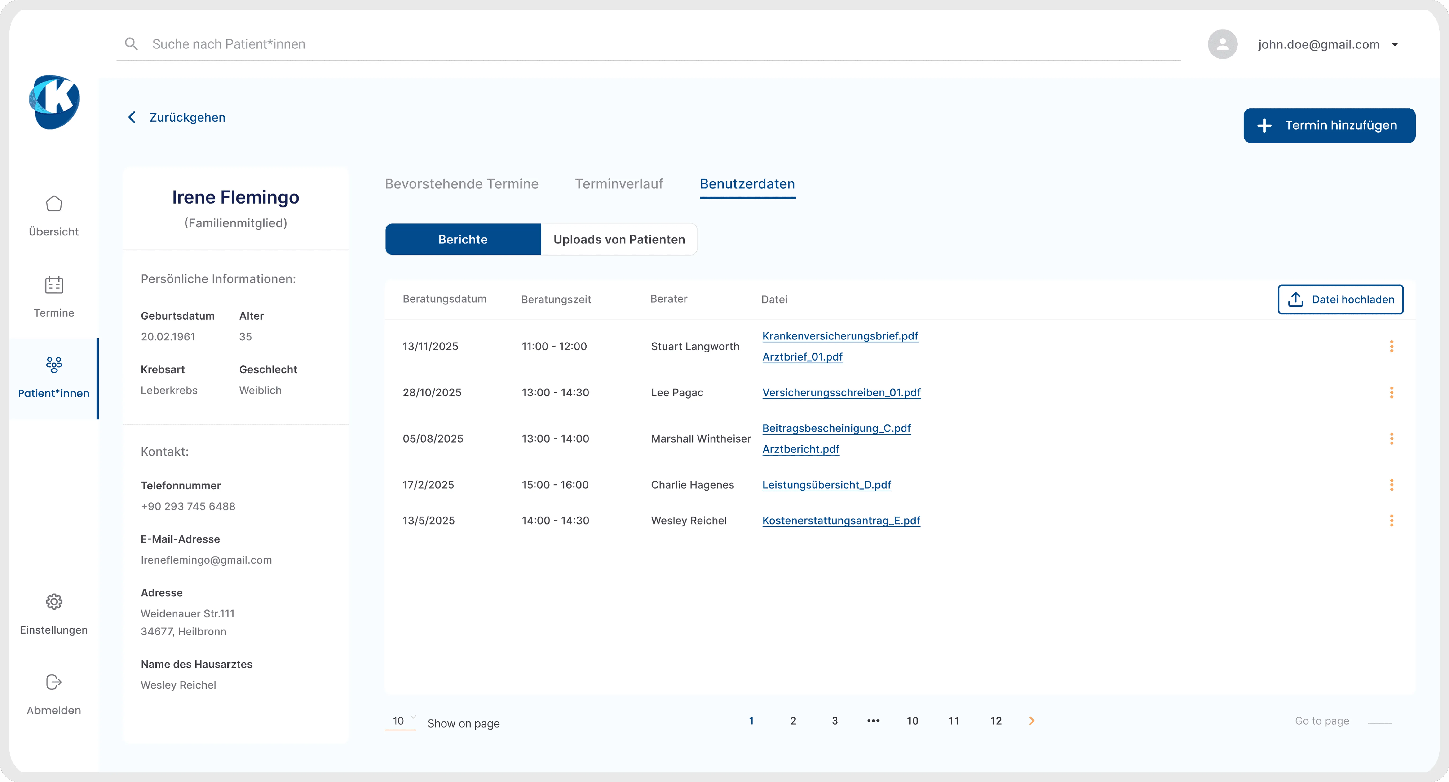
Patient Documents Overview
Counsellor interviews showed documents were scattered across email, folders and paper. This table collects all files per patient, ordered by session, so counsellors can see, open and upload documents without leaving the profile.
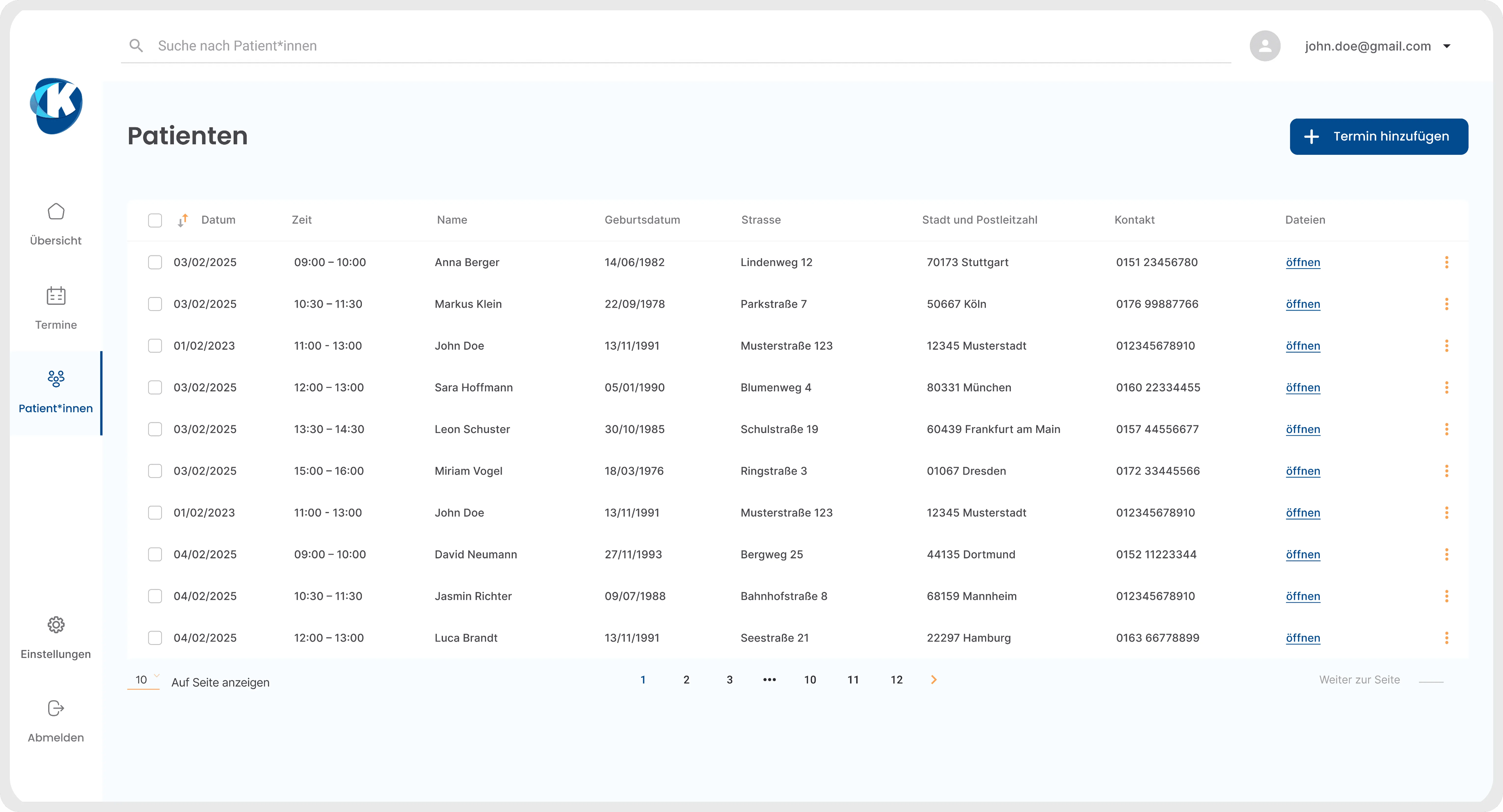
Patient Overview
Interviews showed counsellors already manage their day in Excel-style tables and struggle when patient data is spread across tools. This list keeps all patients and contacts in one sortable view so they can search, open a profile, add appointments or safely remove outdated records in a few clicks.
04. USABILITY TESTING
Mobile App:
- First iteration with 7 patients: the problems they hit and the fixes I designed:
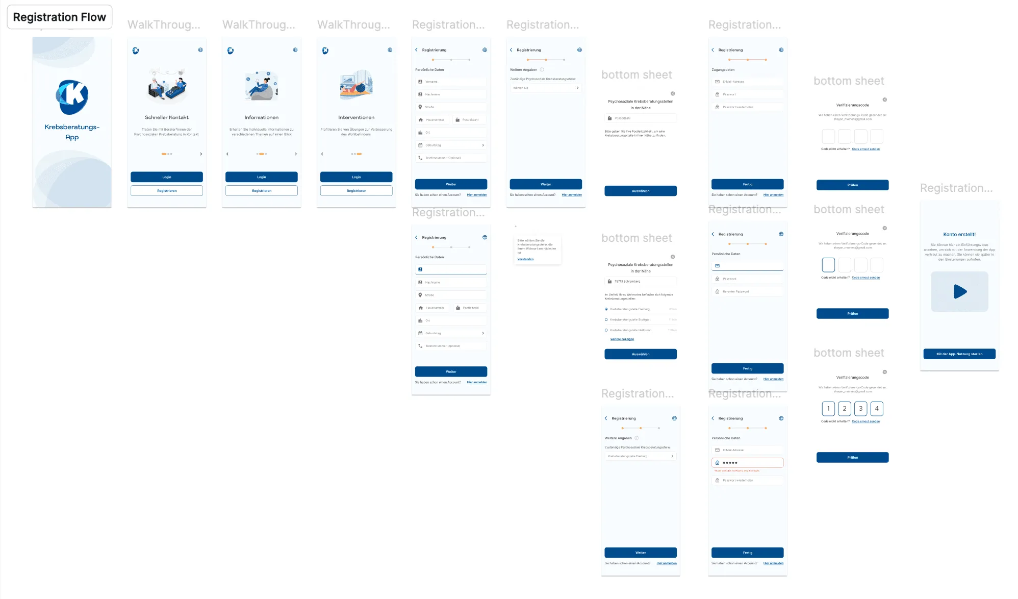
Too many steps for registration → Users got tired before even reaching the app.
What I did: Simplified the registration flow by removing non-essential input fields, after consulting with our counsellor colleagues. Result: in the second round of testing, registration no longer came up as a problem.
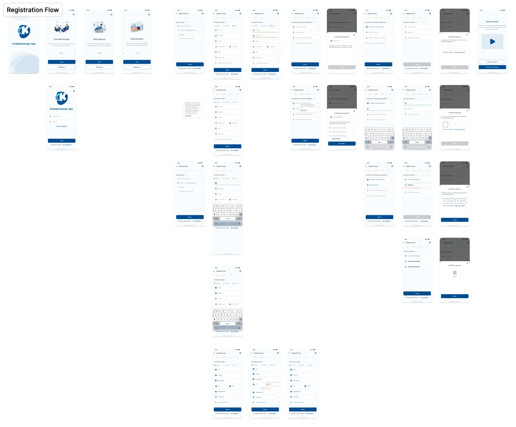
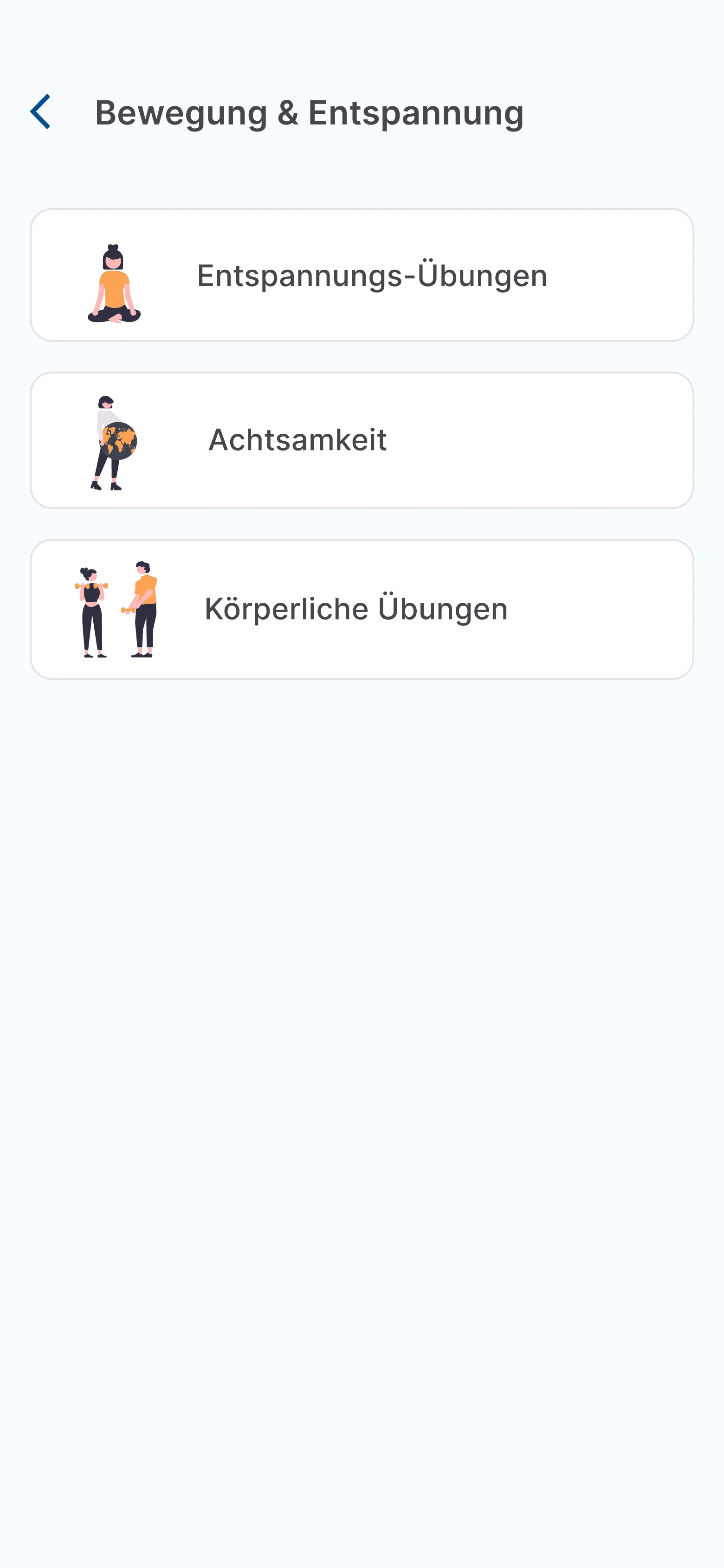
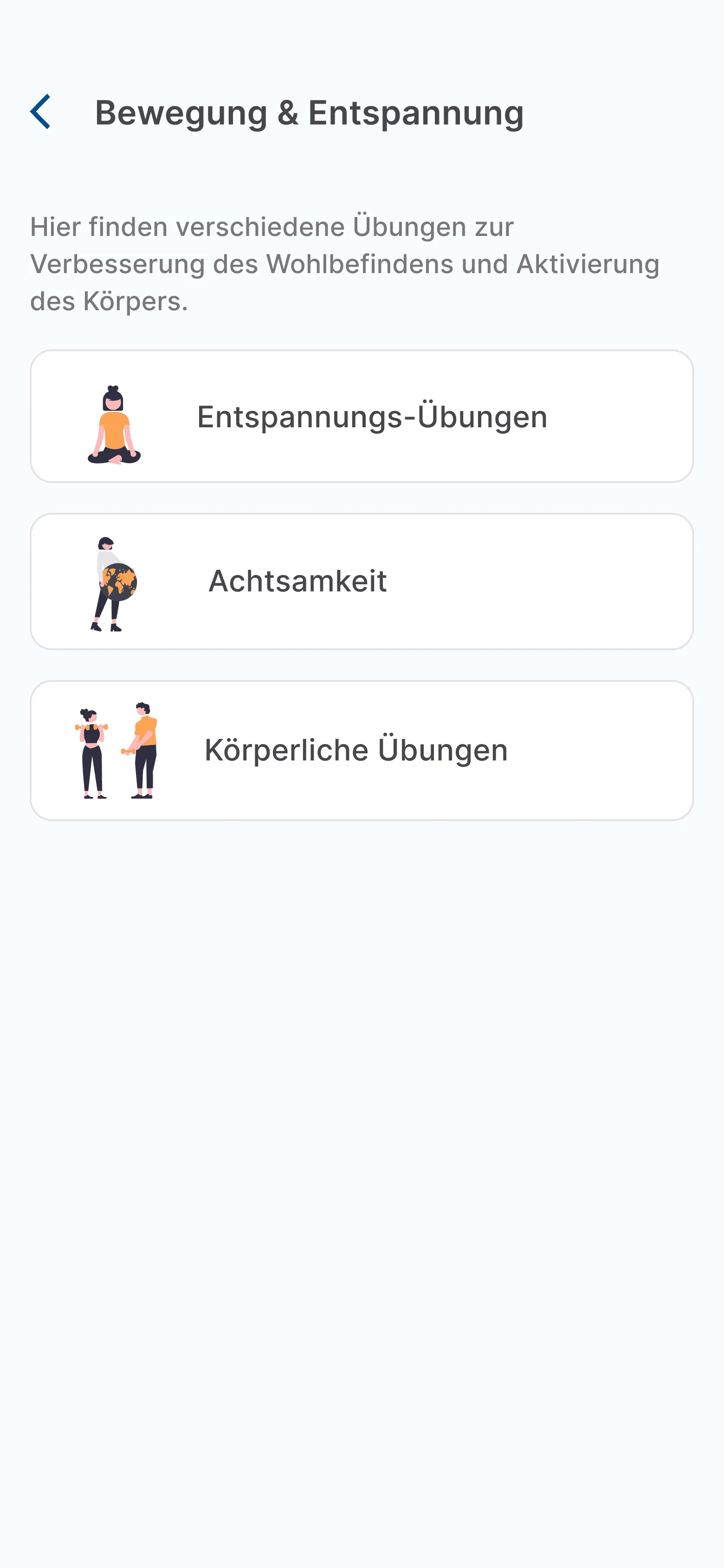
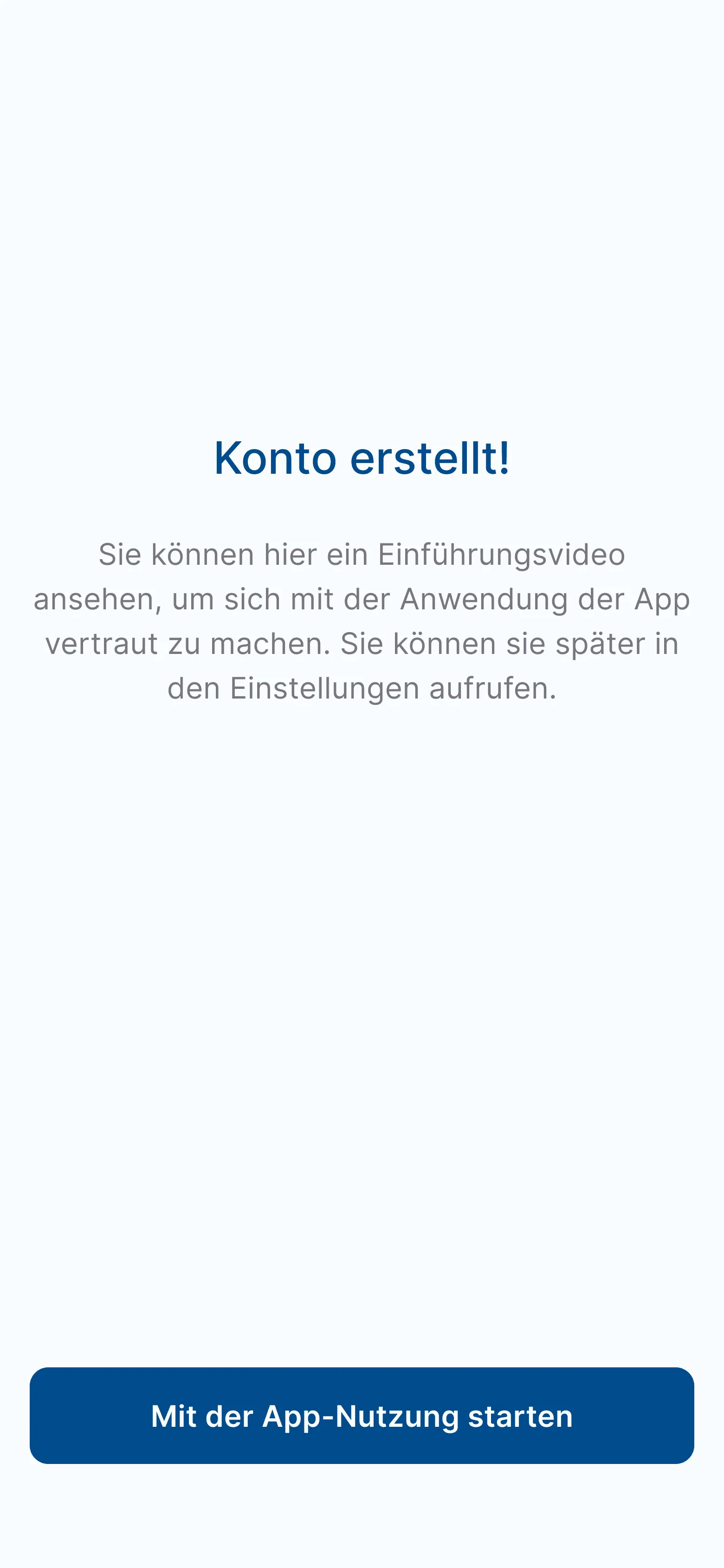
Lack of navigation clarity → Users weren’t sure what to do next after signing up.
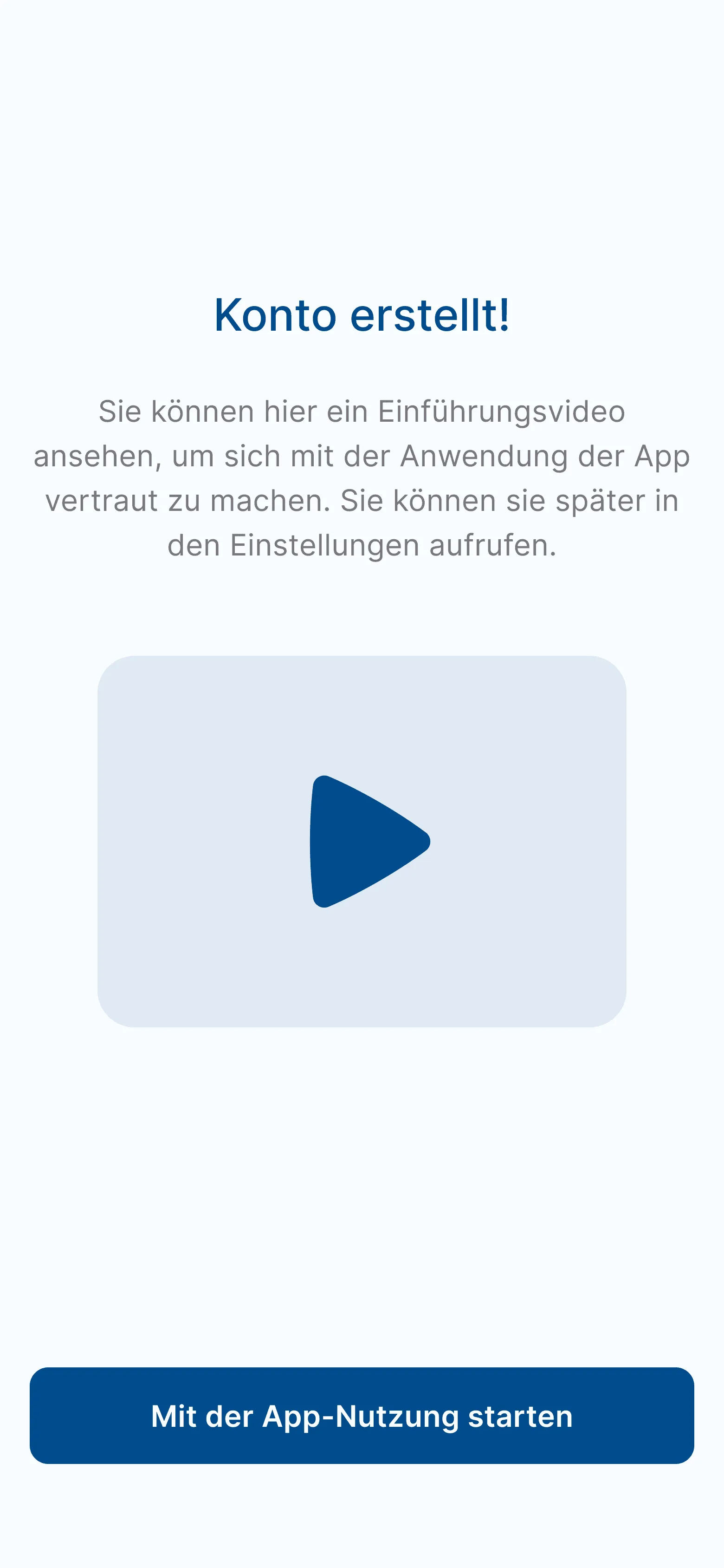
What I did: Added clearer labels and introduced a short intro video explaining how to use the app; shown right after registration and always accessible via Settings.
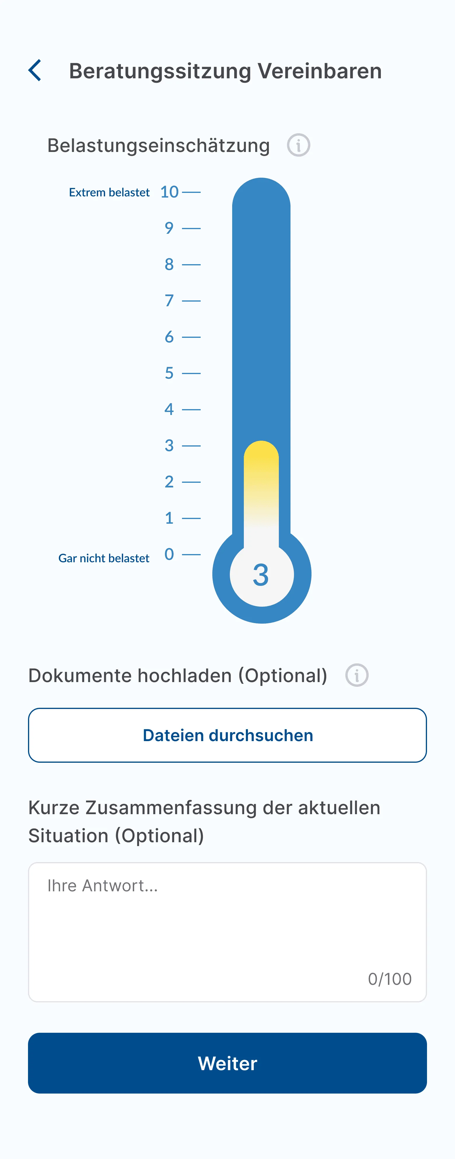
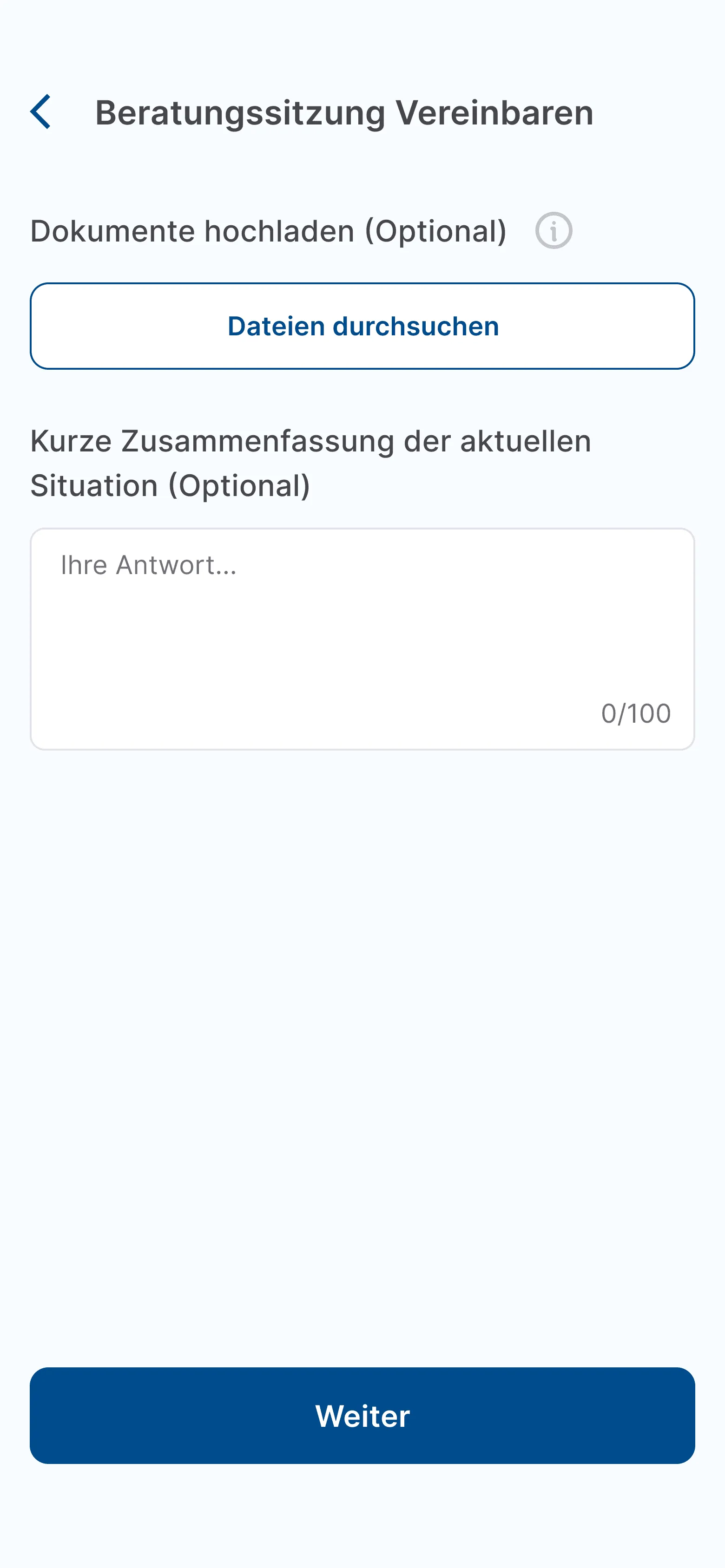
Distress thermometer confusion (a 0–10 scale where patients rated how stressed they felt) → Several users didn’t understand what it measured or how to respond.
What I did: Removed it entirely for the MVP, as counsellors also confirmed it wasn’t a critical feature for the first version.
Confusing tab design → Users often missed key sections or tapped the wrong icons.
What I did: Redesigned the tabs for better visibility and consistency, using more familiar visual cues and active-state feedback.


- Second iteration with 8 patients revealed just one remaining problem:
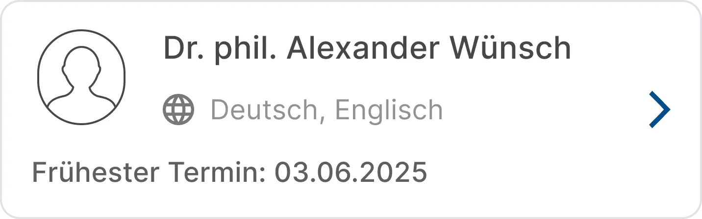
Fully booked counsellor frustration → Patients had to backtrack and restart their booking whenever a counsellor’s calendar was full.
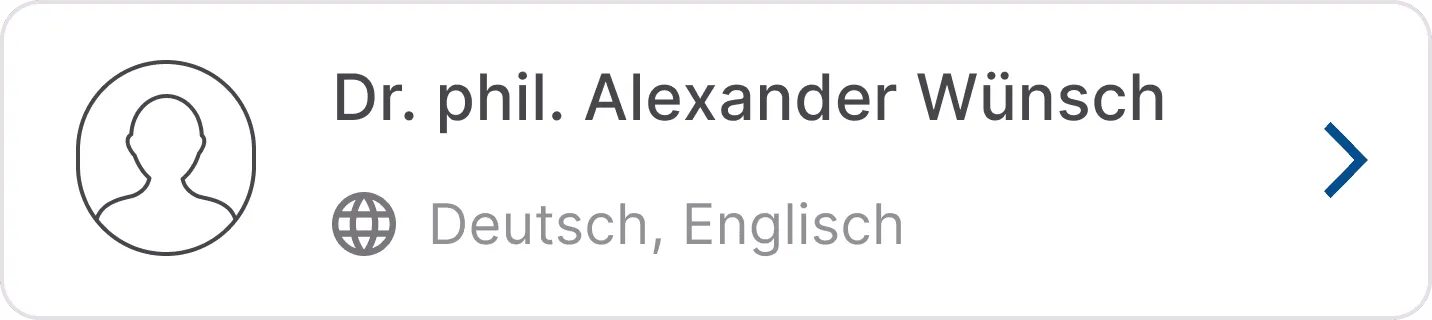
What I did: Added an “Earliest Available Slot” indicator directly on the counsellor card so patients could instantly see earliest availability and decide whether to book or move on.
Desktop App:
- In the usability test of the desktop app with 6 counsellors, the only suggestion was an “Outlook-style” booking view.
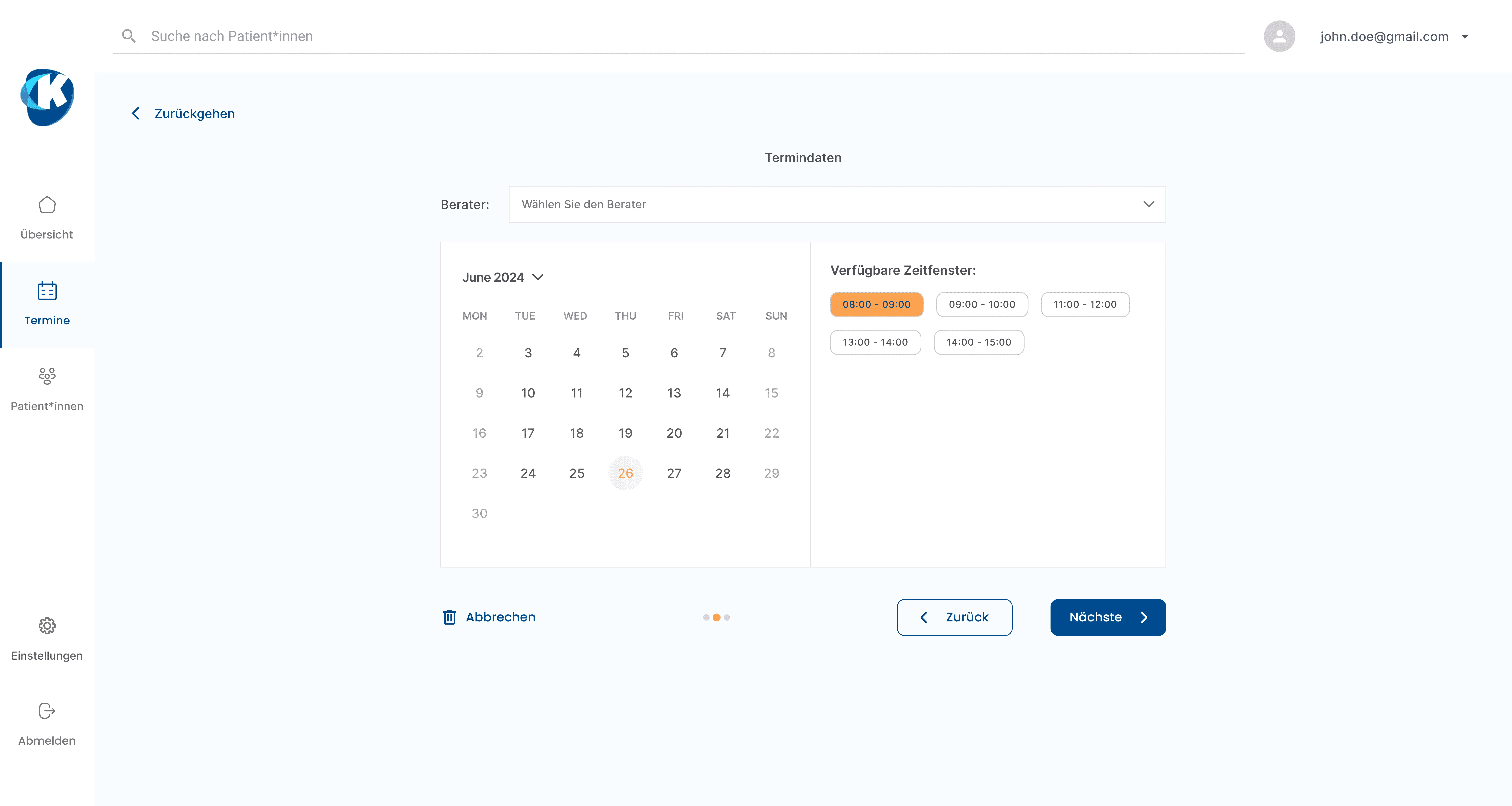
But in the middle of testing, two other tools were approved and took over our original use case. 🚨
Until then, counsellors had to use Meona for GDPR safe calls and scattered tools for documentation. During our tests, Webex was suddenly approved for video and Freinet was deployed for document management, so the core counsellor problems were now covered. So the challenge shifted from building a replacement to designing around the new setup.
To understand whether the problem was local or systemic, we ran student-led research in other centres.
We were legally limited to Freiburg, where many counsellors were colleagues or friends of our team, so we asked a colleague’s students to interview centres in Karlsruhe, Bern (Switzerland) and beyond. They all told a similar story:
- Counsellors everywhere juggled multiple systems.
- Double documentation was the norm.
- Many wanted AI-assisted tools: voice-to-text, live translation.
- But no one wanted yet another standalone platform.
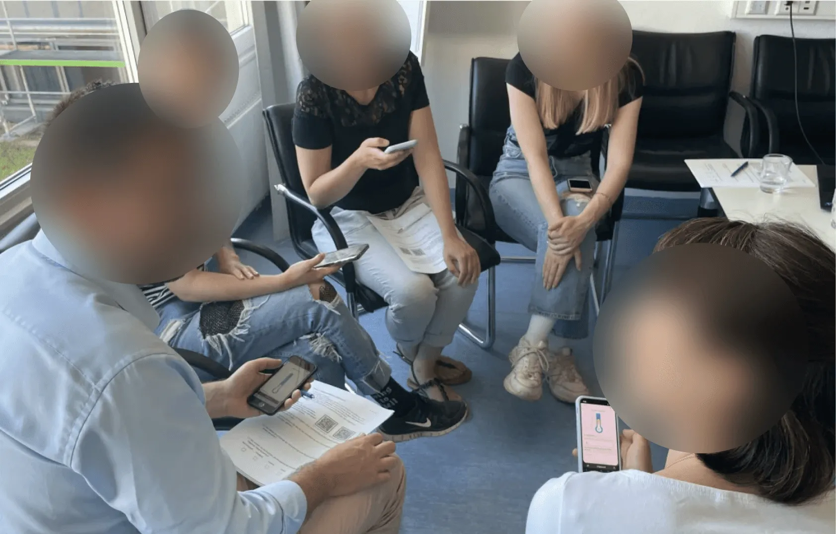
And now I present to you: the “now what?” focus group:
In the last focus group, we brought patients, relatives and counsellors together to ask a simple question: now that the reality has changed, what should this project become?
🌟 THE OUTCOME 🌟
Keep the patient app that people liked, stop trying to replace Freinet and Webex, and instead integrate with them while adding what they still cannot do, like AI powered live translation, voice to text documentation, and emotion aware voice support for counsellors.
🚀 What comes next (after the funding pause):
This workshop wrapped our funding round and put us in pause mode. With the next funding, we plan to add AI translation and transcription, deeper integration with tools like Freinet, better accessibility and languages, and keep co-creating with real users.