Uncorporate Scout · Deutsche Telekom · TSC
From thousands of voices to clear decisions
An internal tool at Telekom Strategy Consulting for reviewing thousands of employee responses about what slows their work down. AI sorts every response into themes and flags what it isn't sure about, so people only step in where their judgment is needed, and every theme ends up with an owner.

Problem
Feedback went in. Decisions didn’t come out.
Every few months, TSC asks employees across Deutsche Telekom where their work gets stuck: three to four thousand free-text responses per campaign. Each one needs four judgments, all done by hand in one Excel workbook. In the pilot, over 1,000 submissions got a theme. Not one got an owner.
Job to be done
When submissions close, the Decision Circle, the leaders who decide what gets fixed, wants to know what matters and who owns it, so decisions don’t wait on someone reading over a thousand responses.
Solution
A tool for reviewers and the Decision Circle to go from over a thousand responses to a short list of themes, each with an owner and a priority. The AI sorts. People decide what gets fixed. And nothing is filed silently.
Employees
1,000+ responses
AI
Sorts & scores each one
AI
Unsure → Action Queue
People
Decide & assign owners
01 Campaign Overview
The first screen a reviewer sees.
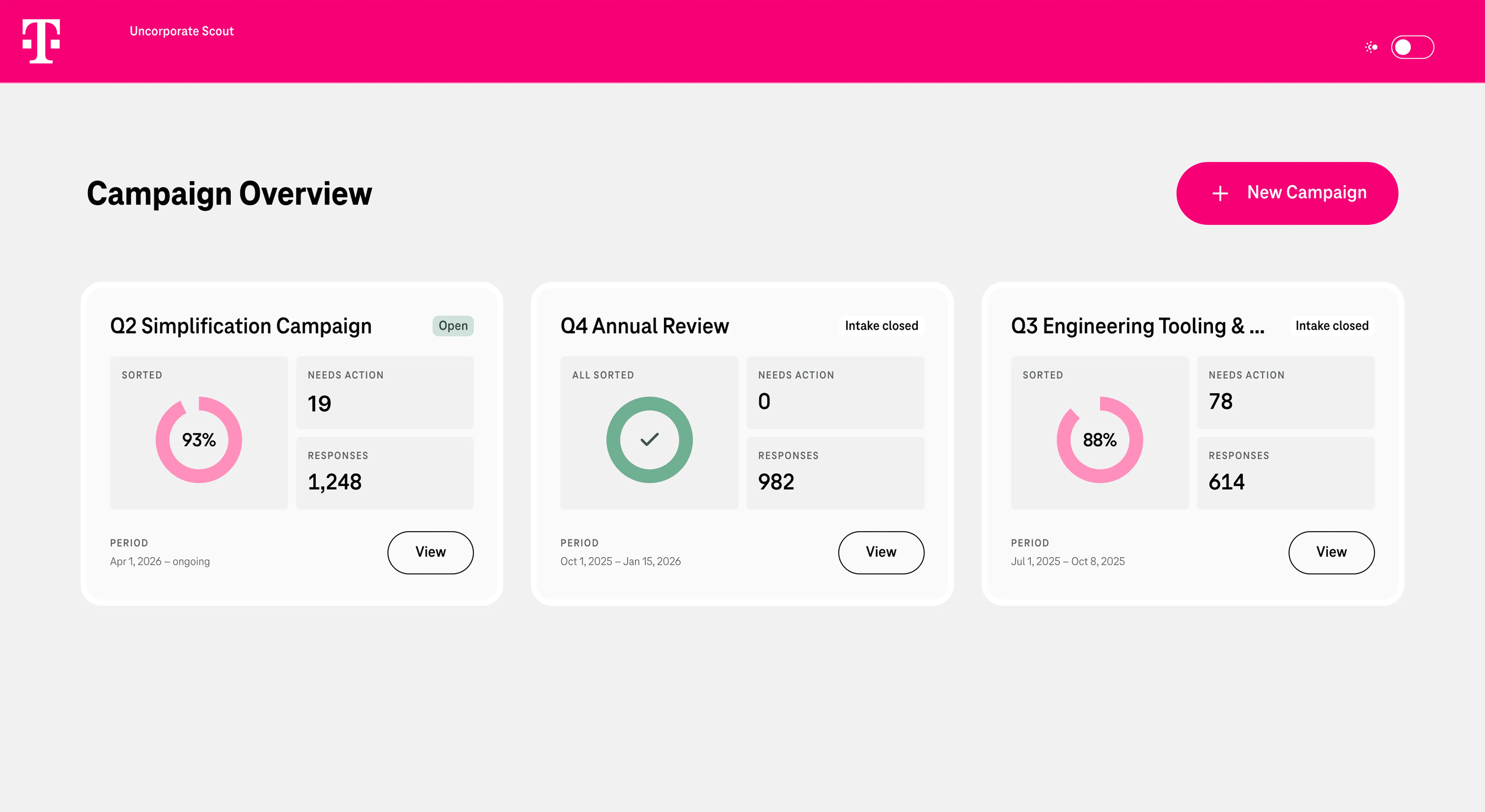
Same three numbers on every card. You can see which campaign is waiting on you without opening any.
ConsistencyNeeds action is a number, not a colour. A red dot says something is wrong. “19” says how much work there is.
Visibility of system statusA finished campaign looks finished. At zero, the progress ring becomes a green check. Most tools are designed full. This one is designed to reach empty.
Goal-gradient effect02 Inside a campaign
Where does this campaign stand?
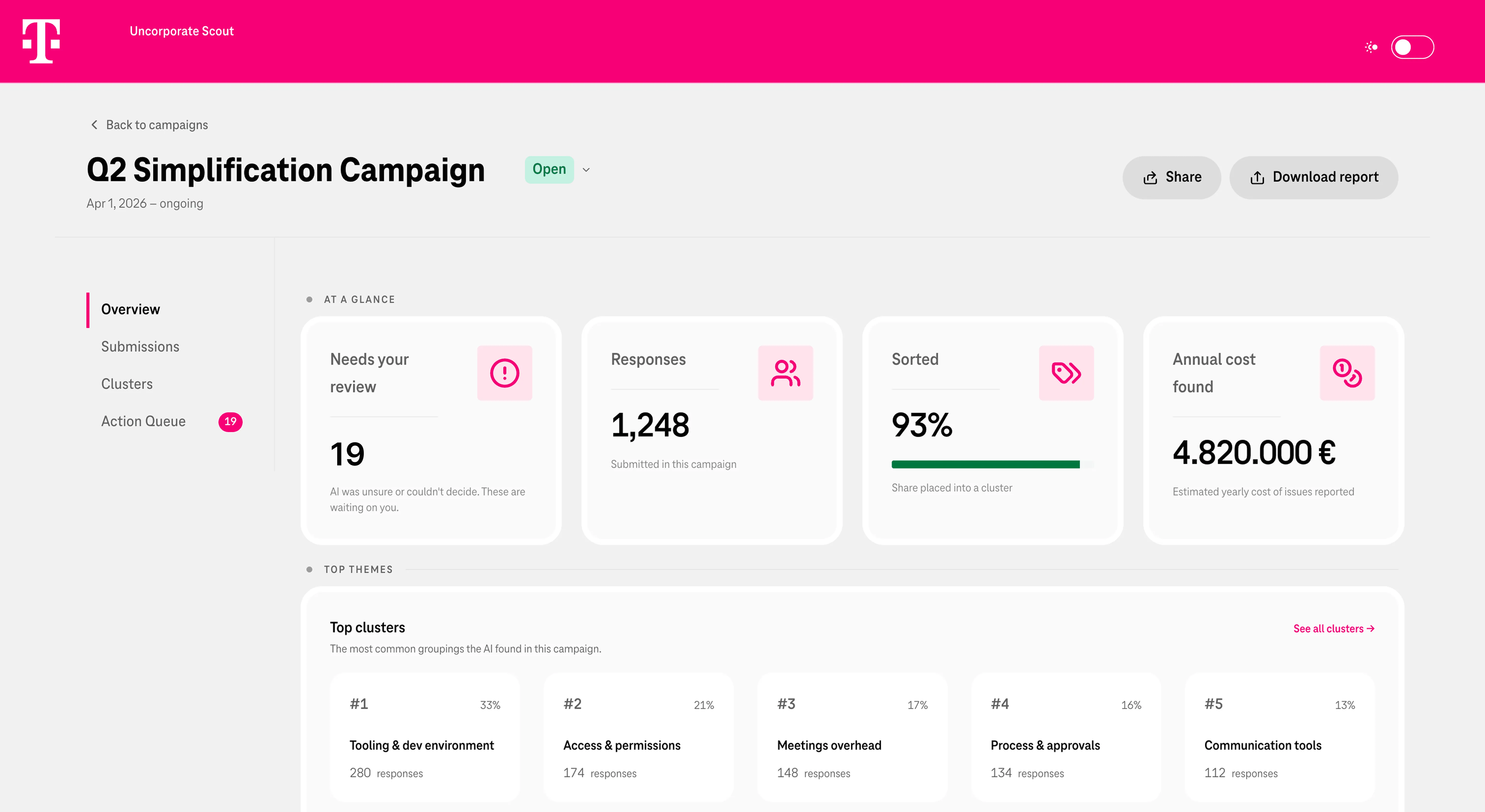
Needs your review comes first. Of the four numbers, only this one asks you to do something. So the first thing you read is your own workload, not the size of the data.
Visual hierarchyFour numbers, not twelve. The system produces dozens of figures. Everything except open work, volume, progress and cost sits one level down.
Progressive disclosureAnnual cost on the first screen. A campaign is judged on whether its problems are worth fixing. That number belongs where the conversation starts.
Real-world match03 Action Queue
Everything waiting on a person, in one place.
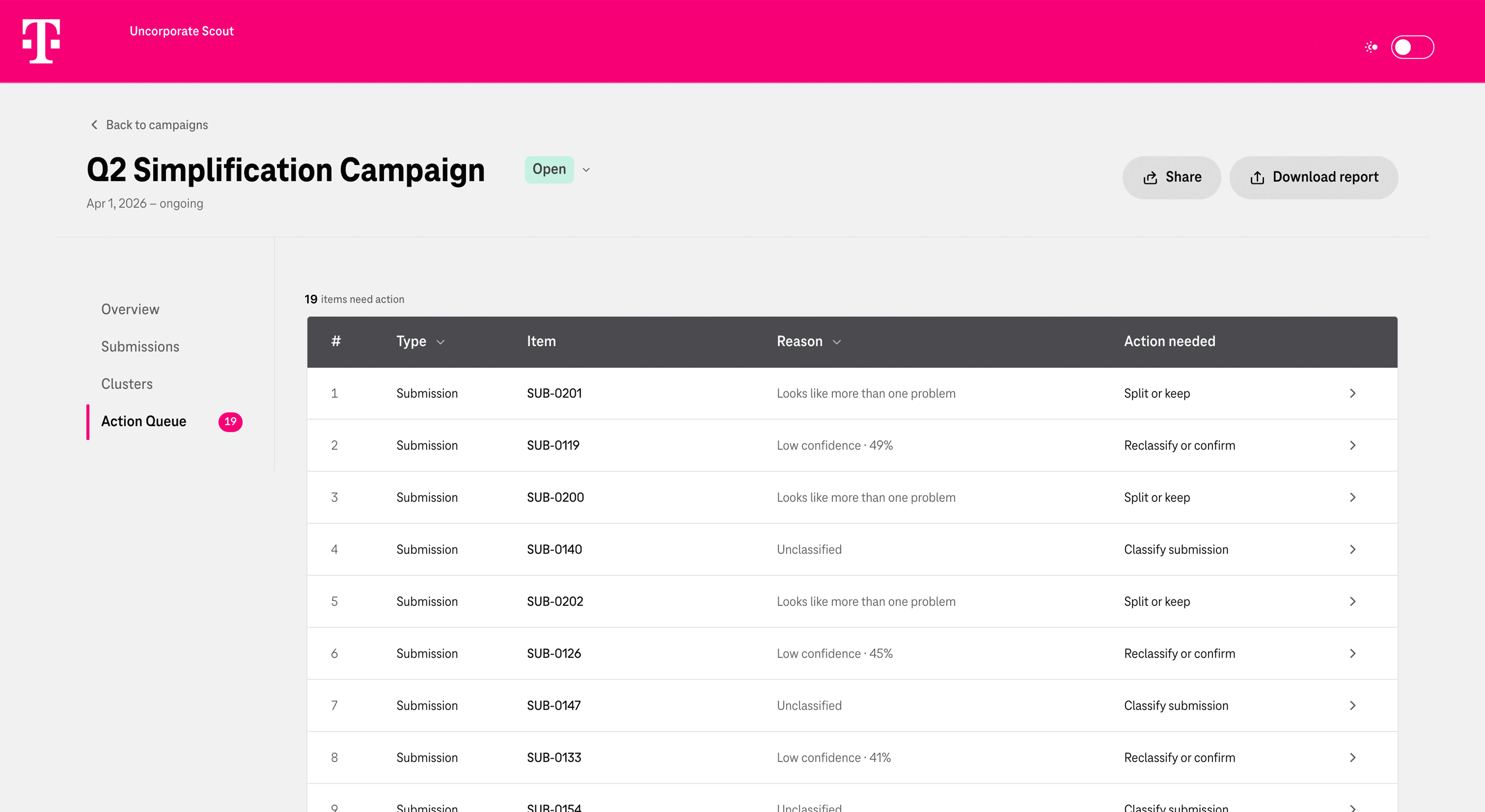
A section, not a filter. A filter is something you have to remember to apply. The queue has its own place in the sidebar, with a count that shrinks as you work.
Visibility of system statusThe reason in words. Each row says why it’s there: “Low confidence · 49%”, “Unclassified”, “Looks like more than one problem”. Nobody has to remember what score counts as low.
Recognition rather than recallEvery row says what to do. “Reclassify or confirm”, “Split or keep”, “Set priority”. The row names the action, not just the problem.
Clear next step04 Clusters
Over a thousand submissions become a short list of themes. The theme, not the submission, is what people decide on.
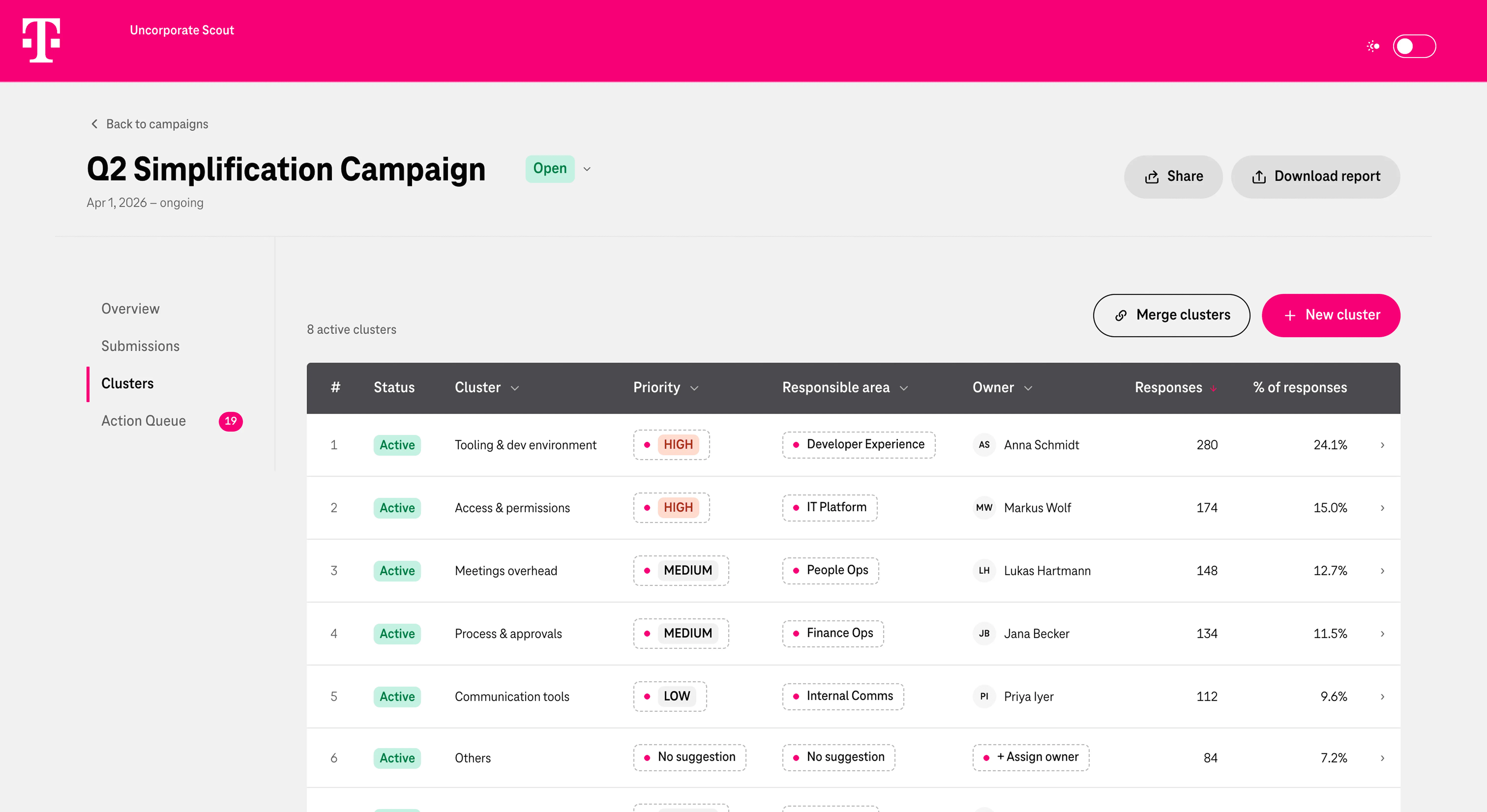
Owner is a column. In the pilot, no submission ever got an owner. Putting it in the table makes the missing step visible: a theme without an owner looks unfinished.
Visibility of system statusSorted by volume. 64% rated their problem as company-wide, so self-ratings couldn’t rank anything. Repetition could. Each theme shows its count and share.
Visibility of system statusPriority is set by a person. The AI can suggest one, based on how often something was reported. A person decides what to do about it.
User control and freedom05 Submissions
The old Excel workbook, rebuilt as a list people can actually work with.
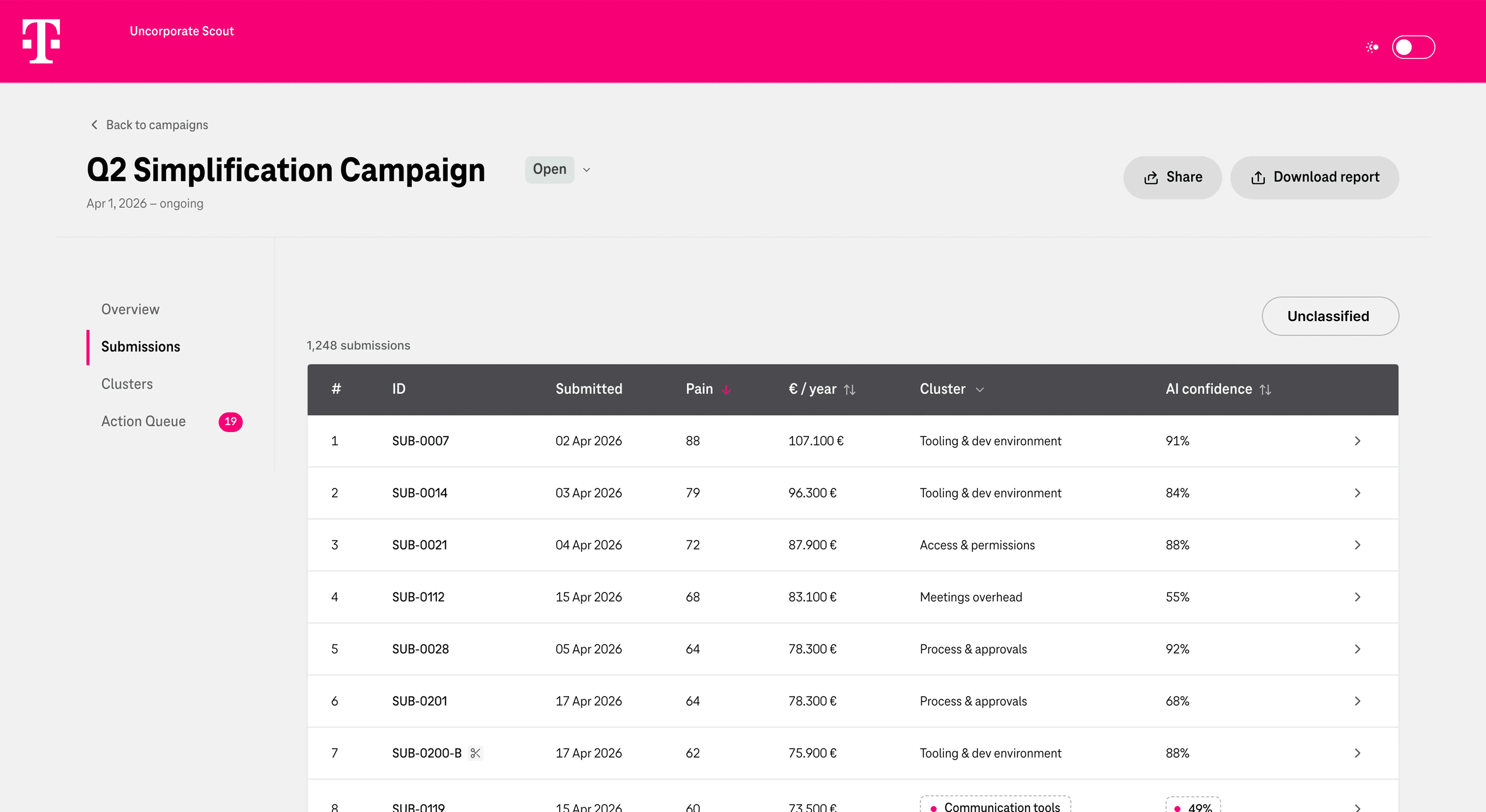
Every submission, sorted or not. The full raw data in one list, with the AI’s cluster and confidence next to each one. Nothing lives in a separate file anymore.
Single source of truthUncertain results are marked in the list. Low-confidence rows get a dashed outline and a dot, so they can’t be mistaken for sorted work.
Error preventionA filter to look, a queue to act. The “Unclassified” filter shows those items in this list. The Action Queue is where they get fixed.
Visibility of system statusWhen the AI is wrong
An AI gives a wrong answer that looks exactly like a right one. So the design assumes it will be wrong, and makes that recoverable rather than invisible.
The limit of this: the queue catches what the AI was unsure about. It doesn’t catch what it filed confidently in the wrong place. That’s the weak point of the design, and the first thing I’d test.
Context & Research
The conditions, and how I worked within them.
Telekom Strategy Consulting is Deutsche Telekom’s in-house consultancy, advising Group leadership on transformation. I worked in its Digitalization & IT practice — the team responsible for digital and AI enablement across TSC — as the only UI/UX designer.
No direct line to users.
Colleagues came to us as internal clients with a problem rather than a specification — a spreadsheet, a deck, sometimes a conversation. Access to the people who’d use the tool was limited, so working out what the product should be was the design work, not the step before it.
Fast work inside a slow system.
Projects moved in weeks, not quarters. The groundwork they depended on — permissions, licences, access to existing systems — took months, and the design couldn’t wait for it.
One designer, several products.
With projects running in parallel, several stakeholders per tool and no design team around me, there was no one to catch inconsistencies or share decisions with. Every call was made once, and had to hold.
What I had to work with.
I was given two things: a requirements document and an Excel workbook of 1,181 responses. The document described what the system should do. The workbook showed how the work had actually been done. So those two files became the research.
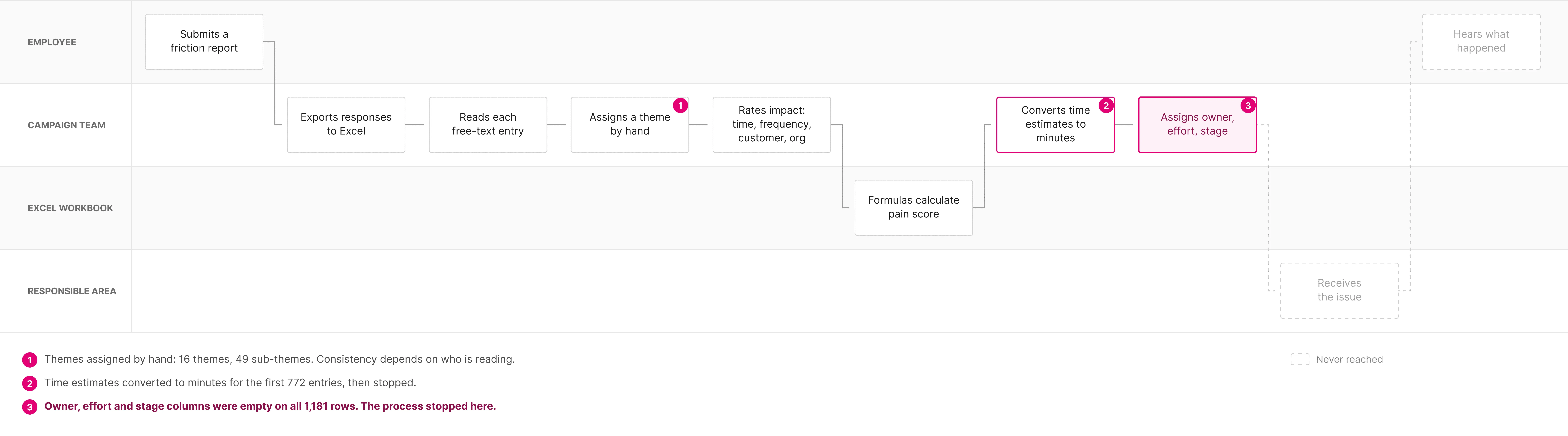
What the workbook showed me.
0%
of responses had an owner, effort or next step filled in — sorting and scoring got done, deciding never started.
Design response: the repetitive work is automated, so people spend their time on the decisions.
1 in 6
picked “I don’t know” for their own segment.
Design response: the AI sorts, not the person submitting.
64%
rated their problem as company-wide, so the scale couldn’t rank anything.
Design response: rank themes by how many people raised them, not by how people rated their own problem.
90,000
words in the pilot alone — and a full campaign is three to four times larger.
Design response: reviewers see only what needs them.
What the requirements document left open.
The requirements document defined how the AI behaves in detail. It said nothing about the person using it. The logic was given. The experience was my job.
GIVEN
- AI sorts responses into themes
- A confidence score per result
- A queue for low-confidence cases
- A status for every case
- Ownership at theme level
LEFT OPEN
- How a reviewer finds their way through them
- How uncertainty is shown, and in what words
- How a review actually happens
- What a finished campaign looks like
- What an owner actually receives
How that shaped the product.
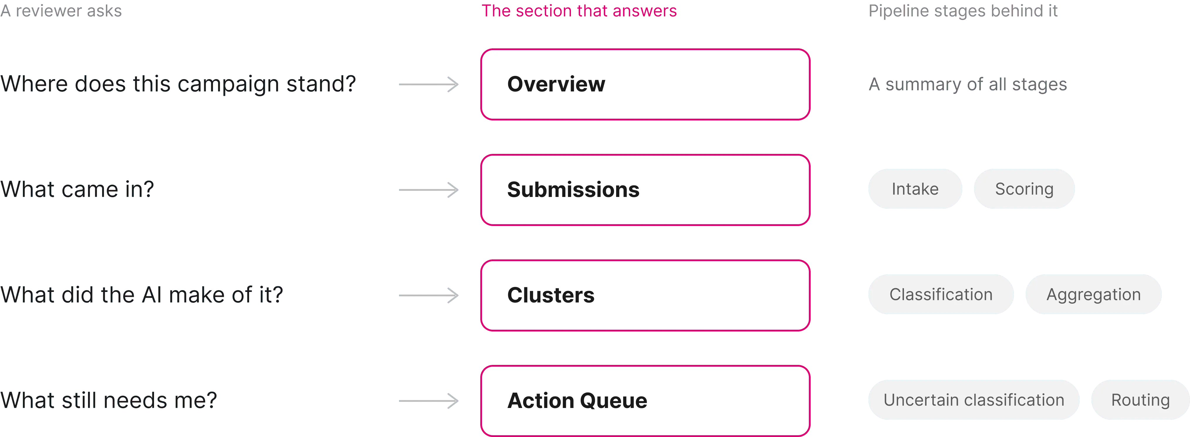
A reviewer asks four things, so the product is built around those questions, not the system’s stages.
Implementation
How I built it
AI shaped the project on three levels: I designed for AI, designed with AI, and built with AI. The product itself uses AI to classify responses. Behind the scenes, AI also became part of my design and development workflow.
Designing with AI
The team needed an MVP quickly, so I used AI to increase the number of ideas I could explore without skipping the reasoning.
Think
ChatGPT
Worked through requirements, flows and early information architecture.
Explore
Claude Code
Turned ideas into working layouts quickly, letting me compare several directions before committing.
Reference
Mobbin MCP
Helped me study patterns from shipped products rather than designing from inspiration alone.
Building with AI
Who built what.
I built the front end myself in Next.js, TypeScript and Tailwind. The backend, the pipeline and the AI classification were the developer’s. The API was the contract between us. I gave Claude Code the requirements, the stack and the working rules, and it set up the codebase.
Inside ODS, Telekom’s design system.
My manager wanted these tools to be aesthetic, not just functional, and built on ODS (One Design System). I installed ODS into the project, so every screen used real components. Then I worked out which parts carry the brand and which are left to the designer. The typeface, the magenta and the way colour is used stayed untouched. Spacing, density and hierarchy aren’t prescribed, and a focused tool needs different density than a general one. That’s where I made this tool fit its purpose.
Data that didn’t exist yet
Access to the real system took months; the design took weeks. So I built against dummy data with realistic volumes and deliberately awkward rows: bilingual categories, missing values, submissions the AI had failed on. When real data connects, the interface will already have met the difficult cases.
The right tool for each decision
For visual choices, like a colour or spacing, I moved screens into Figma and tried options there. It was faster and cheaper than prompting for every small change. Once layout, type and colours were settled, I brought them back into code with Figma MCP.
The last details by hand
The round trip was never exactly one-to-one. Spacing and details shifted each time. So the final polish happened in code, by hand.
One repository
The developer and I worked in the same repository. I built on my own branch and pulled his backend changes in as he made them, so the interface always ran against the current API. When his changes broke a screen, I saw it the same day, not at handover. Every concept had one name, on screen and in the code.
What I learned about working this way
AI
Breadth: many options, fast
Figma
Visual decisions
Code
The final details
Every move between them costs a little accuracy, so I made the big decisions early and the small ones last.
Checking the work
Before handing over the MVP, I went back through the data and tested the design against it myself.
- Something I missed the first time
Going back through the responses, I found something I should have seen earlier: some describe several problems at once. A ticket system that goes down, doesn’t forward tickets and carries wrong data is one submission and three problems. In about 60 responses I read by hand, it was roughly one in ten. An AI check of all 1,181 responses gave the same picture: 126 flagged (about 11%), and a manual spot check confirmed most of its picks. At three to four thousand responses per campaign, that’s hundreds of submissions.
My first read of the data was column by column: fill rates, distributions, category names. I hadn’t read enough of the responses themselves.
What changed: the AI now flags submissions that look like several problems, and a person can split them into separate items, each with its own theme, owner and status. It never splits on its own, and split items don’t count twice toward a theme’s size.
- Trying to do the reviewer’s job
To see whether the themes hold up in practice, I sorted 30 responses myself, using the same 16 themes the AI uses. Self-testing, since I had no access to the people who actually do this.
I got stuck for two reasons. Some responses needed internal knowledge of systems I’d never worked with. Others I understood completely and still couldn’t place: the theme names carry three or four ideas each, so a response often has two or three defensible homes.
What it means: a confidence score doesn’t only measure how clear a response is. It also measures how clear the categories are. Merging themes isn’t a nice-to-have here; it’s how the taxonomy stays usable. It also says something about who should review a campaign: not a generalist, but someone who knows the organisation well enough to know what its systems are called.
Assumptions I’d test first
User access wasn't part of this phase. These are the parts of the design I'd test first, once real people use it.
Reflection
Where it stands
The workspace is built and running on demo data. Campaign views, sorting, scoring and merging work, and the review actions are designed. Deployment is waiting on infrastructure licensing.
What this project confirmed about designing for AI
I designed Scout from the problem, not from a framework. Checked afterwards against Google’s People + AI Guidebook and Microsoft’s Guidelines for Human-AI Interaction, it follows what both recommend: help people know when to trust the AI, treat errors as normal, and make correction easy.
A trade-off I made knowingly
Themes over submissions. Deciding on sixteen themes instead of over a thousand responses makes the work possible. The cost is that an individual case can disappear. A problem hitting three people in a critical process can rank below one affecting a hundred mildly. Volume is the honest signal available; it isn’t the only one that matters.